Geographic data is everywhere—embedded in our smartphones, powering ride-sharing apps, guiding logistics trucks, and even shaping public health strategies. For businesses, harnessing the power of geographic data can unlock a new realm of insights, from pinpointing customer clusters to optimizing supply chains. But raw geographic data, often complex and layered, is only useful when visualized effectively. With the right visualization methods, companies can transform abstract coordinates and boundaries into clear, actionable intelligence.
This article explores how to effectively visualize geographic data, why it matters for businesses, the various visualization techniques available, and the real-world impacts such visualizations deliver. We’ll evaluate leading tools, offer practical guidance, and present a comparative overview to help you make informed choices for your organization.
The Strategic Value of Visualizing Geographic Data
Geographic data visualization—also known as geovisualization—means displaying spatial information on a map or in a geographic context. Businesses today sit atop a wealth of such data, generated by everything from point-of-sale systems to social media check-ins.
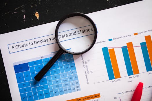
.png)
The strategic value of visualizing this data is significant:
- $1: 72% of organizations report that geospatial analytics improve their ability to make strategic decisions, according to a 2023 Forbes Insights survey. - $1: Companies that leverage geospatial visualizations grow revenue 15% faster, on average, than their peers (Boston Consulting Group, 2022). - $1: Visualizing location-based risks—like weather events or supply chain disruptions—helps companies respond proactively.For example, Starbucks uses geographic data visualization to select store locations based on traffic patterns, demographics, and proximity to competitors. Similarly, logistics firms like UPS have slashed delivery times by optimizing routes with spatial analysis.
Key Techniques for Visualizing Geographic Data
Not all geographic data visualizations are created equal. The right technique depends on the business question at hand, the type of data available, and the audience you’re targeting.
Here are some widely used visualization methods:
1. $1: These use color shading to represent values within defined areas, such as sales by region or population density by state. 2. $1: Reveal concentrations or intensity of activity, such as customer footfall in retail zones. 3. $1: Each dot represents a data point, ideal for visualizing distributions (e.g., disease outbreaks, store locations). 4. $1: Show movement or migration—useful for mapping supply chains, migration patterns, or delivery routes. 5. $1: Use circles or icons sized proportionally to the data, such as market size by city.Choosing the right technique is crucial. For example, a heat map may clearly convey customer hotspots, while a flow map is better for visualizing logistics networks.
Tools and Platforms for Geographic Data Visualization
Dozens of tools now make it possible to create powerful geographic visualizations without a PhD in cartography. Here’s a comparative overview of some leading options:
| Tool | Best For | Key Features | Pricing |
|---|---|---|---|
| Tableau | Business analytics & dashboards | Interactive maps, real-time data, integration with GIS | From $70/user/month |
| ArcGIS Online | Advanced spatial analysis | 3D maps, geocoding, demographic enrichment | From $100/user/year |
| Google Maps Platform | Web/app integration | Custom maps, live traffic, Street View | Pay-as-you-go API pricing |
| Mapbox | Custom visualizations & apps | Highly customizable, vector maps, mobile SDKs | Free tier, then pay-as-you-go |
| QGIS | Open-source GIS | Comprehensive GIS tools, plugin support | Free |
Each tool has strengths: Tableau excels at business dashboards, ArcGIS at deep spatial analytics, and Mapbox at custom web maps. The best choice depends on your technical capacity, budget, and goals.
Best Practices for Effective Geographic Data Visualization
To ensure that geographic visualizations drive real business value, it’s important to follow best practices:
- $1: Start with a clear objective—e.g., “Where should we open our next store?” or “Which areas have the highest delivery delays?” - $1: Avoid overcrowding maps. For example, a national map with street-level data can become confusing. - $1: Colors should be intuitive and accessible. Use gradients for continuous data and distinct colors for categories. - $1: Remove unnecessary elements. Focus on the data that answers your core question. - $1: Labels, legends, and explanatory notes help users interpret the visualization correctly. - $1: Geographic errors can have serious business consequences. Double-check data sources and projections. - $1: Interactive maps allow users to zoom, filter, and explore—leading to deeper insights.A 2021 study by Nielsen Norman Group found that interactive, focused maps improved user comprehension by over 40% compared to static, cluttered ones.
The Impact of Geographic Data Visualization on Business Performance
The business impact of effective geographic data visualization can be dramatic. Here are some real-world examples:
- $1: Walmart uses geospatial visualization to optimize store locations, increasing per-store revenue by up to 20%. - $1: DHL reduced mileage by 12% across Europe after visualizing and re-routing deliveries based on geographic bottlenecks. - $1: Domino’s Pizza targeted promotions to high-demand delivery areas, boosting conversion rates by 17%. - $1: Insurance companies use real-time flood maps to adjust policy pricing and reduce claims exposure.According to the Geospatial Information & Technology Association (GITA), companies that invest in geographic visualization report an average return on investment (ROI) of 20-25% within the first two years.
Challenges and Solutions in Geographic Data Visualization
Despite its value, geographic data visualization comes with challenges:
- $1: Inaccurate or outdated location data can mislead decisions. Solution: Regularly update and validate data sources. - $1: Some tools require GIS expertise. Solution: Leverage user-friendly platforms or partner with specialists. - $1: Visualizing customer locations can raise privacy issues. Solution: Aggregate data to anonymize individuals and comply with regulations like GDPR. - $1: Too much data can overwhelm users. Solution: Use clustering, filtering, and appropriate map scales.Overcoming these challenges requires both technical and managerial attention. Training teams, setting clear data governance policies, and choosing the right tools can make a significant difference.
Future Directions: Innovations in Geographic Data Visualization
The landscape of geographic data visualization is evolving rapidly:
- $1: Advances in IoT and 5G enable live tracking of assets, vehicles, and even foot traffic. - $1: Virtual reality (VR) and augmented reality (AR) are making it possible to “walk through” data landscapes. - $1: Machine learning algorithms can highlight geographic patterns that might be missed by the human eye. - $1: With over 3.8 billion smartphone users globally, mobile-optimized maps are essential for field teams and on-the-go decision-makers.Gartner predicts that by 2026, 60% of organizations will use location analytics as a key part of their data strategy, up from just 27% in 2021.
Unlocking Business Growth with Geographic Data Visualization
Effective geographic data visualization bridges the gap between complex data and business strategy. By transforming spatial data into clear, actionable maps, organizations can spot trends, optimize operations, and uncover growth opportunities that would otherwise remain hidden. As digital transformation accelerates, the ability to visualize where and how things happen is no longer optional—it’s a competitive necessity. With the right tools, techniques, and best practices, any business can turn geographic insight into measurable results.