Enhancing Customer Experience in Retail Through Advanced Data Visualization Methods
Retail has always thrived on understanding customers—what they want, when they want it, and how they like to shop. In the digital age, retailers are inundated with data from transactions, online browsing, loyalty programs, and even in-store sensors. But raw data alone cannot improve customer experience. The real magic happens when this data is visualized effectively, turning overwhelming numbers into actionable insights. Data visualization methods are transforming retail by making customer preferences, behaviors, and pain points visible, enabling smarter decision-making at every level. This article explores the most impactful data visualization techniques for enhancing customer experience in retail, and how these methods are shaping a new era of personalized, responsive shopping.
The Importance of Data Visualization in Retail Customer Experience
Modern retail generates an astounding amount of data. According to a 2023 study by Statista, the global retail industry produced over 2.5 quintillion bytes of data daily. Navigating this sea of information is impossible without effective data visualization. When retailers translate complex data into easy-to-understand visuals, they unlock the ability to:
- Identify shopping trends rapidly - Personalize offers and communications - Optimize store layouts and digital interfaces - Respond proactively to customer feedbackMcKinsey research shows that companies leveraging advanced analytics, including visualization, improve customer satisfaction scores by up to 20% and can boost sales conversion rates by 15%. Clear, actionable visuals empower retail teams to act quickly and confidently, directly impacting the customer journey.
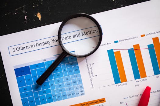
.png)
Key Data Visualization Methods for Retail
Retailers use a variety of data visualization methods to enhance the customer experience. Each method serves a unique purpose, from understanding broad patterns to drilling down into granular details.
1. Heat MapsHeat maps are among the most popular tools for visualizing customer interaction both in-store and online. By representing data intensity with color gradients, heat maps can show which parts of a website, app, or even a physical store are most frequently engaged.
- In physical stores, heat maps generated via Wi-Fi tracking or cameras reveal high-traffic areas, helping retailers optimize product placement and staffing. - On digital platforms, click and scroll heat maps highlight which banners, buttons, or product categories capture the most attention. 2. Customer Journey MapsCustomer journey maps visualize the path shoppers take from discovery to purchase, including all touchpoints and interactions along the way. These diagrams can expose bottlenecks, friction points, or opportunities for delight at every stage.
- According to Salesforce, 66% of customers expect companies to understand their unique needs. Journey mapping helps retailers fulfill this expectation by tailoring experiences at each step. - Retailers like IKEA and Sephora use journey maps to refine omnichannel experiences, ensuring consistency whether customers shop online, via mobile, or in-store. 3. Cohort Analysis VisualizationGrouping customers into cohorts—such as by acquisition date, purchase history, or demographics—enables retailers to visualize behavioral trends over time. Cohort analysis helps answer questions like: Which campaigns drive repeat purchases? How does loyalty evolve across customer groups?
- For instance, a retailer may discover that customers acquired via Instagram ads have a 30% higher 6-month retention than those acquired via email. - Visualization tools such as line graphs or area charts make these patterns clear, guiding targeted engagement strategies. 4. Sentiment Analysis DashboardsRetailers increasingly use sentiment analysis to gauge customer emotions from reviews, social media, and surveys. Visualization tools aggregate and display sentiment scores, highlighting areas for improvement.
- A 2022 survey by BrightLocal found that 77% of consumers “always” or “regularly” read reviews when browsing for local businesses. Visualization dashboards can reveal spikes in negative sentiment, prompting immediate action. - Pie charts, word clouds, and time-series graphs are common methods to represent sentiment data.Real-World Case Studies: How Retailers Use Visualization to Transform CX
Let’s look at how leading retailers are using data visualization to enhance customer experience:
- Walmart employs spatial heat maps to analyze in-store movement, adjusting product placement and signage. As a result, they reported a 6% increase in impulse purchases in test stores. - Nike uses interactive dashboards to monitor social media sentiment in real time. During a product launch, they quickly detected a negative trend related to sizing, allowing them to clarify sizing charts and reduce returns by 12%. - Fashion retailer ASOS relies on cohort analysis visualizations to study customer retention across regions. Insights from these visuals led to region-specific loyalty programs, increasing repeat purchase rates by 18% in targeted markets.Comparing Data Visualization Tools for Retail CX
Choosing the right data visualization tool is critical. The table below compares four leading tools favored by retailers for customer experience analytics:
| Tool | Key Features | Data Sources Supported | Best For | Notable Users |
|---|---|---|---|---|
| Tableau | Drag-and-drop dashboards, heat maps, real-time data | POS, CRM, web, IoT | Complex, interactive visualizations | Walmart, L’Oréal |
| Microsoft Power BI | Custom reports, AI-assisted insights, integration with Office 365 | ERP, sales, social media | Enterprise reporting | Marks & Spencer, H&M |
| Google Data Studio | Free, integrates with Google Analytics, real-time dashboards | Web, app, advertising | Web analytics | Adidas, Target (for web) |
| Qlik Sense | Associative data engine, advanced filtering, smart search | POS, supply chain, CRM | Self-service dashboards | Best Buy, Lowe’s |
Selecting the right tool depends on the retailer’s size, data complexity, and specific business goals.
Emerging Visualization Techniques: Going Beyond Charts and Graphs
While classic charts remain valuable, innovative visualization methods are gaining traction in retail:
- Geospatial Analysis: Visualizing customer locations and movement patterns helps retailers plan new store locations, delivery routes, or in-store navigation aids. For example, Starbucks uses geospatial dashboards to optimize store density in urban areas. - Augmented Reality (AR) Visualizations: Some retailers are experimenting with AR overlays, allowing customers or employees to visualize store analytics in real time through smart devices. This can support instant inventory checks or customer flow monitoring. - Network Graphs: Visualize relationships among products, customers, or influencers. For instance, network graphs can show which products are frequently bought together, supporting smarter cross-selling and in-store displays.In 2023, the adoption of immersive visualization technologies (like AR and 3D mapping) in retail rose by 38%, according to Retail TouchPoints, underlining a shift toward more interactive data experiences.
Data Visualization Best Practices for Retailers
To fully realize the benefits of data visualization, retailers should follow these best practices:
1. Start with a Clear ObjectiveDefine the specific customer experience question or challenge you want to address. Whether it’s reducing cart abandonment or improving store navigation, a focused objective ensures that visuals drive action.
2. Prioritize User-Friendly DesignData visuals should be intuitive and accessible to all relevant teams, not just data analysts. Use clear labels, legends, and avoid cluttered graphics. According to a 2021 Nielsen Norman Group study, dashboards with simplified visuals improved decision-making speed by 28%.
3. Integrate Data from Multiple TouchpointsCustomer journeys span online, mobile, and physical channels. The most impactful visualizations combine data sources—such as POS, CRM, and web analytics—for a holistic view.
4. Enable Real-Time InsightsRapid response is crucial in retail. Choose visualization tools and methods that support real-time or near real-time data updates, especially for monitoring customer sentiment and in-store activity.
5. Test, Iterate, and ShareContinuously test visualization approaches, gather feedback, and iterate. Share insights widely across teams to foster a customer-centric culture.
Shaping the Future: Data Visualization’s Role in Customer-Centric Retail
As competition intensifies and customer expectations evolve, data-driven retailers will continue to outpace those relying on gut feeling alone. Data visualization turns complex retail data into clear, actionable insights, directly improving customer experience. From heat maps that guide store layouts to sentiment dashboards that inform product development, these methods are shaping a new standard of personalized, responsive retail.
Retailers investing in advanced visualization techniques are seeing measurable gains—increased sales, higher retention, and improved satisfaction scores. As emerging technologies like AR and geospatial analytics mature, the potential for even richer, more interactive customer insights will only grow. For retailers, the message is clear: mastering data visualization is no longer optional—it’s essential for delivering experiences that delight and retain customers in the modern marketplace.