Data is the lifeblood of modern marketing, and social media has become one of the richest sources of consumer insights. Every second, users generate vast amounts of content, likes, shares, and comments across platforms like Facebook, Instagram, Twitter, TikTok, and LinkedIn. Yet, this torrent of raw information can be overwhelming without effective tools to make sense of it. This is where data visualization steps in—a powerful approach to distill complex social media data into clear, actionable insights. By transforming numbers into compelling graphics and interactive dashboards, marketers can spot trends, measure performance, and refine their strategies with unprecedented precision. In this article, we’ll explore how to use data visualization for social media analysis and how it can supercharge your marketing strategies for maximum impact.
The Role of Data Visualization in Social Media Analysis
Social media platforms boast over 4.8 billion users worldwide as of 2024, collectively producing billions of interactions daily. Marketers are keen to tap into this data to understand audiences, content performance, and brand sentiment—but without visualization, it’s nearly impossible to grasp the bigger picture.
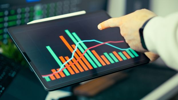
Data visualization refers to the graphical representation of information and data. When applied to social media analysis, it turns overwhelming datasets into visuals like charts, graphs, heat maps, and network diagrams. This enables marketers to:
.png) - Quickly identify which content types drive the most engagement
- Monitor follower growth and audience demographics in real time
- Track sentiment and brand mentions across platforms
- Pinpoint influencers and key opinion leaders within their niche
- Quickly identify which content types drive the most engagement
- Monitor follower growth and audience demographics in real time
- Track sentiment and brand mentions across platforms
- Pinpoint influencers and key opinion leaders within their niche
According to a 2023 survey by Dresner Advisory Services, 59% of companies cited visual analytics as "critical" or "very important" for business intelligence. For social media managers, leveraging these tools can be the difference between a campaign that resonates and one that falls flat.
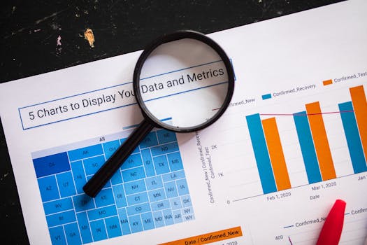
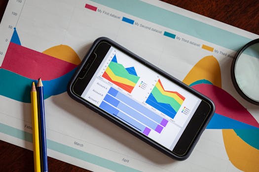
Essential Visualization Techniques for Social Media Data
Different types of data call for different visualization methods. Here are some of the most effective techniques tailored for social media analysis:
1. Time Series Charts Track follower counts, engagement rates, or hashtag usage over days, weeks, or months. Line graphs allow marketers to spot spikes after campaigns or dips during quiet periods. For example, a brand might notice a surge in mentions after launching a new product. 2. Heat Maps Visualize when your audience is most active online. By mapping engagement or post frequency by hour and day, you can optimize posting schedules for maximum reach. Research by Sprout Social shows that posting during peak engagement times can boost impressions by up to 30%. 3. Network Graphs These reveal relationships between users, highlighting influencers or clusters of engaged followers. Network analysis is particularly useful for identifying micro-influencers and mapping the spread of viral content. 4. Sentiment Analysis Visuals Pie charts, bar graphs, or color-coded word clouds can display the ratio of positive, neutral, and negative mentions tied to your brand. This helps marketers gauge public perception at a glance. 5. Comparative Bar Charts Compare performance across platforms, campaign types, or audience segments. For instance, side-by-side bars can show which social channel delivers the best ROI or which demographic group engages the most.Comparing Social Media Platforms: Where Should You Focus?
Each social media platform has its own audience characteristics, content formats, and engagement patterns. Data visualization helps marketers decide where to allocate resources for the highest impact. The table below highlights key metrics across major platforms as of early 2024:
| Platform | Monthly Active Users | Average Engagement Rate | Top Content Type | Best Posting Time |
|---|---|---|---|---|
| 2.4 billion | 1.16% | Short Videos (Reels) | Wed, 11am-1pm | |
| 2.98 billion | 0.07% | Images & Live Videos | Tue & Thu, 9am-12pm | |
| Twitter (X) | 556 million | 0.05% | Threads & Polls | Mon-Fri, 9am-3pm |
| 950 million | 0.35% | Industry Insights | Wed, 10am-12pm | |
| TikTok | 1.6 billion | 6.72% | Short-Form Video | Thu, 7pm-9pm |
This data-driven overview can be visualized through bar charts or interactive dashboards, making it easier to compare and prioritize efforts. For example, while Facebook remains the largest platform, TikTok boasts the highest average engagement rate—suggesting a shift in where brands might focus their creative energy.
Turning Insights into Action: Improving Marketing Strategies
The true value of data visualization lies in its ability to guide smarter decision-making. Here’s how marketers can use visualized social media data to refine their strategies:
Optimize Content Creation By visualizing which posts receive the most engagement, brands can double down on successful formats. For example, if heat maps show that Instagram Reels outperform static images, the content calendar can be adjusted accordingly.
Refine Audience Targeting Visual breakdowns of follower demographics and locations help marketers tailor messaging. For instance, if data visualization reveals a growing Gen Z audience on TikTok, campaigns can be crafted to align with their interests and tone.
Enhance Campaign Timing Time series and heat map visualizations show when audiences are most active. By scheduling posts during peak hours, marketers can increase visibility and interaction rates. According to Hootsuite, brands that post during optimal windows see up to 20% higher engagement.
Monitor Brand Health in Real-Time Interactive dashboards that track sentiment and mentions across platforms enable brands to respond quickly to PR crises or capitalize on positive buzz. A spike in negative sentiment can trigger immediate reputation management responses.
Benchmark Against Competitors Comparative visualizations allow brands to see how they stack up against competitors in terms of engagement, follower growth, and share of voice. This competitive intelligence informs future strategy and goal setting.
Popular Tools for Social Media Data Visualization
There is an expanding suite of tools designed to turn social media metrics into interactive visuals. Some of the most popular options include:
Tableau Widely used for business intelligence, Tableau connects to social media APIs and offers customizable dashboards. Its drag-and-drop interface makes it accessible for non-technical users.
Google Data Studio A free tool that integrates with platforms like Google Analytics and YouTube. Marketers can create real-time reports and share them with stakeholders.
Sprout Social This platform combines social media management with reporting features. Visualizations include engagement trends, competitor comparisons, and audience breakdowns.
Power BI Microsoft’s Power BI offers robust data integration, including connectors for Twitter and Facebook. Its visualization capabilities are ideal for large teams seeking to centralize reporting.
Brandwatch Focused on social listening, Brandwatch provides visualizations for sentiment, trends, and influencer mapping. It is particularly strong for brand health monitoring.
Common Pitfalls and How to Avoid Them
While data visualization is a powerful tool, there are common mistakes marketers should watch out for:
Overloading with Information Too many charts or overly complex dashboards can overwhelm users. Focus on a few key metrics that drive your objectives.
Ignoring Context Visuals without context can be misleading. Always accompany charts with brief explanations or annotations to clarify what the data means.
Relying on Vanity Metrics It’s tempting to focus on follower counts or likes, but deeper engagement and sentiment metrics often provide more actionable insights.
Neglecting Data Quality Visualization is only as good as the data behind it. Ensure your data sources are accurate, up-to-date, and consistently formatted.
Failing to Act on Insights Finally, the biggest pitfall is failing to translate data insights into strategic action. Schedule regular reviews and use visualizations as the foundation for decision-making discussions.
Unlocking Strategic Advantage with Data Visualization
Social media marketing is more competitive—and more data-driven—than ever before. Data visualization transforms raw social metrics into clear, actionable intelligence. By leveraging the right techniques and tools, marketers can identify what works, refine their targeting, optimize timing, and outperform competitors. As platforms evolve and user behaviors shift, the ability to quickly interpret and act on data visualizations will remain a crucial advantage for brands aiming to connect meaningfully with their audiences.