With the explosive growth of smartphones and tablets, mobile devices have become the primary way people access information—including data visualizations. In fact, as of 2024, over 59% of all global web traffic comes from mobile devices, according to Statista. But what works beautifully on a desktop screen can become confusing, crowded, or even unreadable on a mobile phone. Optimizing data visualizations for mobile devices isn’t just a matter of shrinking graphics to fit a smaller screen; it’s about rethinking design, interaction, and performance to ensure clarity and accessibility.
This article explores proven strategies and best practices for tailoring data visualizations to mobile devices. Whether you’re a business analyst, designer, developer, or content creator, these insights will help you deliver crystal-clear, impactful visual data to users on the go.
Understanding the Unique Challenges of Mobile Data Visualization
Mobile devices pose several distinct challenges for visualizing data:
.png) - $1: The average smartphone screen measures just 5.5 to 6.5 inches diagonally, compared to 13-27 inches for desktops. This can restrict the amount of data and detail you can display.
- $1: Instead of a precise mouse, users rely on fingers, which are less accurate and can obscure important details.
- $1: Devices differ widely in processing power, operating system, browser, and display resolution.
- $1: Mobile users are often multitasking or viewing data in less-than-ideal conditions (e.g., outdoors or while commuting).
- $1: The average smartphone screen measures just 5.5 to 6.5 inches diagonally, compared to 13-27 inches for desktops. This can restrict the amount of data and detail you can display.
- $1: Instead of a precise mouse, users rely on fingers, which are less accurate and can obscure important details.
- $1: Devices differ widely in processing power, operating system, browser, and display resolution.
- $1: Mobile users are often multitasking or viewing data in less-than-ideal conditions (e.g., outdoors or while commuting).
These factors make it imperative to rethink not just the “how” but also the “what” and “why” of data visualization for mobile audiences.
Choosing the Right Chart Types for Mobile
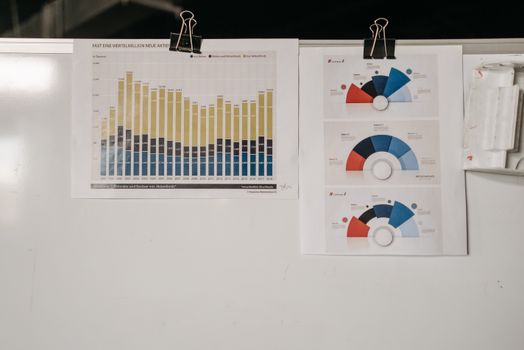
Not all visualization formats translate well to smaller screens. Complex or dense graphics, such as heatmaps or detailed scatter plots, can lose meaning when scaled down. Instead, opt for chart types that preserve clarity and impact in a minimal space. Here’s a comparative overview:
| Chart Type | Mobile Suitability | Typical Use Case | Example |
|---|---|---|---|
| Bar Chart | High | Comparing categories | Sales by region |
| Line Chart | High | Trends over time | Stock price movement |
| Pie Chart | Medium | Showing parts of a whole | Market share |
| Scatter Plot | Low | Correlations between variables | Height vs weight |
| Heatmap | Low | Density patterns | Website click tracking |
| Donut Chart | Medium | Parts of a whole | Budget breakdown |
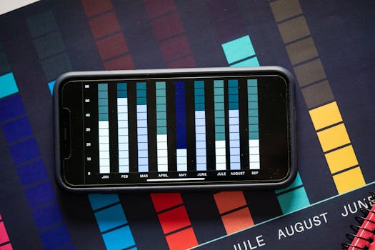
As a general rule, bar charts and line graphs work best on mobile because they remain readable even when simplified. Avoid charts that require fine distinctions between many data points, or that depend on complex legends.
Designing for Readability: Simplifying Visual Elements
Simplicity is the cornerstone of effective mobile data visualization. With restricted space and potential distractions, it’s crucial to eliminate unnecessary clutter and focus on the key message. Here are several actionable tips:
- $1: Don’t try to show everything at once. For example, instead of displaying 20 years of data, highlight the most recent five years or significant milestones. - $1: Ensure labels and values are readable without zooming. The recommended minimum font size for mobile is 14px. - $1: Use high-contrast color schemes for backgrounds, lines, and text to improve visibility, especially in bright or outdoor conditions. - $1: If possible, label data directly on the chart rather than using a separate legend. This reduces eye movement and confusion. - $1: Use color, size, or bolding to highlight the most important trends, outliers, or comparisons.A study by the Nielsen Norman Group found that users are 30% more likely to engage with data visualizations that are clean and simple, especially on mobile.
Enabling Effective Interaction: Touch, Zoom, and Drill-Down
Mobile devices thrive on touch-based interaction. While desktop users might hover over a chart for details, mobile users need intuitive alternatives. Consider these approaches:
- $1: Allow users to tap on chart elements (bars, lines, or segments) to reveal tooltips, values, or annotations. This keeps the default view uncluttered. - $1: Enable pinch-to-zoom for complex charts, allowing users to focus on specific areas. Panning lets them explore large datasets horizontally or vertically. - $1: Start with a simple summary visualization, then let users drill down into more detailed charts or tables as needed. - $1: Unlike hover tooltips, sticky tooltips remain visible until dismissed, preventing accidental loss of information.A well-known example is Google Analytics’ mobile app, which uses tap and swipe gestures to transition between summary and detail views, making analytics data accessible without overwhelming the user.
Optimizing Performance and Load Times
Performance is critical on mobile, where users expect fast, responsive interactions. According to Google, 53% of mobile users abandon sites that take longer than 3 seconds to load. Data visualizations can be resource-intensive, so consider these optimization techniques:
- $1: SVG files scale cleanly and load faster than raster images, ensuring charts look crisp on any screen. - $1: Only load visualizations when they come into view, rather than all at once. This reduces initial page load times. - $1: Display a summary or a sample of large datasets, with options to load more details on demand. - $1: Minimize the amount of data sent to the device by pre-processing or aggregating datasets server-side. - $1: Subtle transitions are fine, but complex animations can slow down performance and frustrate users.For example, the BBC News mobile site uses SVG-based graphics and lazy loading to ensure that even complex election result maps load quickly and remain interactive on mobile.
Accessibility: Making Mobile Visualizations Usable for All
Accessibility isn’t optional—it’s a legal and ethical imperative. Over 2.2 billion people worldwide have some form of vision impairment, according to the World Health Organization. To make your mobile data visualizations accessible:
- $1: Ensure at least a 4.5:1 contrast ratio between text and background. - $1: Use patterns, shapes, or labels in addition to color to distinguish data series. - $1: Add descriptive alt text and ARIA labels to charts so screen readers can convey the information. - $1: For users with assistive devices, ensure charts can be navigated and interacted with using keyboards or switch controls. - $1: Always offer a tabular version of your data for users who prefer or require non-visual access.One example of accessible mobile data visualization is the COVID-19 Dashboard by Johns Hopkins University, which provides both interactive charts and downloadable data tables, along with accessible color schemes.
Best Tools and Frameworks for Mobile Data Visualization
For those building mobile-friendly visualizations, several tools and frameworks stand out in 2024:
- $1: Widely used, lightweight, and supports responsive design out-of-the-box. - $1: Highly customizable, though it requires more development effort; supports touch and responsive layouts. - $1: Easy to embed and automatically adapts to different screen sizes. - $1: Offers specific mobile modules and accessibility features. - $1: For enterprise dashboards, Tableau’s mobile app optimizes views for touch and small screens.Choosing the right tool depends on the complexity of your data, level of interactivity required, and development resources.
Key Takeaways: Delivering Impactful Data Visualizations on Mobile
Optimizing data visualizations for mobile devices is essential as mobile internet usage continues to rise. By carefully selecting chart types, simplifying design, enabling intuitive interaction, optimizing for performance, and ensuring accessibility, you can create visualizations that inform and engage users wherever they are.
Remember these essentials: - Prioritize clarity over density—less is more on mobile. - Design for touch, not just clicks. - Keep performance and accessibility top of mind. - Test your visualizations on multiple devices and in real-world conditions.By applying these strategies, you’ll ensure your data stories are not only seen but truly understood on every screen.