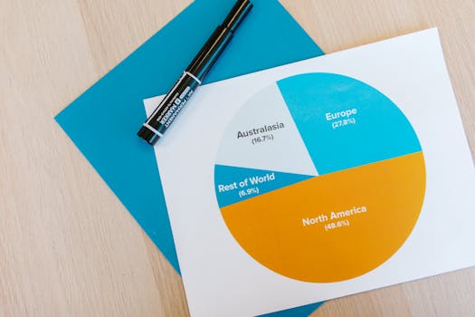
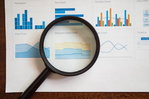
Designing charts that communicate clear, accurate, and actionable insights is both an art and a science. While many people can create a chart using modern tools, designing meaningful charts that truly resonate with audiences demands a thoughtful approach. This article explores best practices for designing meaningful charts, focusing on aspects often overlooked: context, audience, ethics, accessibility, and the intelligent use of color and annotation. Whether you’re a business analyst, educator, or anyone tasked with presenting data, these strategies will help you craft visualizations that make a real impact.
Understanding the Purpose: Context Drives Chart Design
Before you choose a chart type or start formatting your data, it’s essential to understand the context in which your chart will be used. A meaningful chart begins with clarity about its purpose.
For example, a chart designed for an executive summary should highlight high-level trends or key performance indicators, while a chart for a technical report may need to display granular data. According to a 2023 survey by Data Visualization Society, 68% of professionals reported that misalignment between chart design and intended context led to misinterpretation of data.
.png) Key questions to ask:
- Who will view this chart?
- What decision or action should this chart inform?
- What level of detail is required?
Key questions to ask:
- Who will view this chart?
- What decision or action should this chart inform?
- What level of detail is required?
By starting with the “why” and “who,” you ensure that every design choice moves you closer to your communication goal.
Audience Matters: Tailoring Complexity and Detail
Not all viewers have the same level of data literacy or the same information needs. A meaningful chart bridges the gap between data and audience.
For a general audience, simplicity is crucial. For example: - Use familiar chart types (bar, line, pie) - Limit the number of data series (ideally 4 or fewer) - Provide clear axis labels and legendsFor expert audiences, more complex visualizations like scatterplots or heatmaps may be appropriate, but only if the viewer can interpret them. A 2021 Nielsen Norman Group study found that comprehension rates for complex charts were 34% higher among expert viewers than general audiences.
Consider this comparative overview:
| Audience | Preferred Chart Features | Potential Pitfalls |
|---|---|---|
| General Public | Simple charts, clear labels, minimal data series | Overwhelming with data, ambiguous legends |
| Business Executives | High-level trends, actionable insights | Too much detail, lack of focus |
| Technical Experts | Detailed visualizations, multiple variables | Oversimplification, missing nuance |
Tailoring your chart design to your audience’s expertise ensures your message is both accessible and compelling.
Ethical Visualization: Avoiding Misleading Charts
Meaningful charts must be honest and transparent. Misleading visualizations can result in misinformed decisions, loss of trust, or even financial loss. According to a study by the University of Michigan, 47% of surveyed professionals admitted they had been misled by a chart within the past year.
Common pitfalls include: - Truncated axes: Starting a bar chart at a value other than zero can exaggerate differences. - Inconsistent intervals: Irregular spacing on axes distorts trends. - Cherry-picked data: Omitting relevant data to make a point.For example, a 2022 news article used a line graph with the y-axis starting at 90 rather than zero, making a minor increase appear dramatic. This type of distortion can easily sway public opinion inaccurately.
Best practices for ethical chart design: - Always label axes and start at zero when using bar charts - Use consistent intervals on axes - Show the full data range or clearly indicate when data is truncated (and why) - Disclose sources and any data exclusionsEthical visualization protects both the integrity of your message and your credibility as a communicator.
Color and Annotation: Enhancing, Not Distracting
Color is a powerful tool in chart design, but it must be used wisely. According to Adobe’s 2020 Color Trends Report, charts with more than four colors decrease user comprehension by up to 17%. Color should highlight key information, not overwhelm the viewer.
Best practices include: - Use a limited, consistent color palette - Reserve bright or contrasting colors for the most important data points - Avoid using color as the only means of conveying information (for accessibility) - Test for colorblind accessibility; about 8% of men and 0.5% of women are colorblind worldwideAnnotation—adding notes, arrows, or callouts—also enhances meaning. For example, annotating a sudden spike in a sales chart with “New Product Launch” provides immediate context. In a 2019 experiment by the Journal of Information Visualization, annotated charts improved recall of key facts by 24% compared to unannotated ones.
Remember: - Annotations should be concise and directly relevant - Avoid cluttering the chart with excessive notesWell-chosen color and annotation help direct attention without distracting from the main message.
Accessibility: Making Charts Inclusive for Everyone
Designing meaningful charts means ensuring that everyone, regardless of ability, can understand them. Digital accessibility is not just a legal requirement in many regions—it’s also best practice.
According to the World Health Organization, over 2.2 billion people globally have some form of visual impairment. If your chart can’t be understood by these users, it’s not truly meaningful.
Key steps for accessible chart design: - Use patterns or textures in addition to color to differentiate data series - Provide alternative text (alt text) that describes the chart’s main message - Ensure sufficient contrast between text and background (WCAG recommends a contrast ratio of at least 4.5:1 for normal text) - Make interactive charts keyboard-navigableFor example, Microsoft Excel and Power BI allow users to add alt text to charts, making them more accessible for screen readers.
Inclusive chart design broadens your impact and ensures your insights reach the widest possible audience.
Iterative Feedback: Test, Refine, and Improve
No chart is perfect on the first try. The most meaningful charts are the result of feedback and iteration. In a 2023 survey by Tableau, 74% of data professionals reported that peer review improved their chart’s clarity and accuracy.
Effective feedback processes include: - Sharing drafts with colleagues or sample audience members - Asking specific questions: “What’s the main message you get from this chart?” - Adjusting layout, labels, color, or detail level based on feedbackFor example, a marketing team may test a customer segmentation chart with both sales reps and management to ensure it communicates effectively at all levels.
Iteration is not a sign of failure, but a path to clarity and insight.
Conclusion: Designing Charts That Make a Difference
Designing meaningful charts goes beyond selecting a chart type or plugging in data. It requires deliberate choices about context, audience, ethics, color, accessibility, and continuous improvement. When these best practices are followed, charts transcend decoration and become powerful tools for understanding and action.
Remember: the true power of a chart lies not in its complexity, but in its ability to illuminate the story within the data—clearly, honestly, and inclusively.