Presenting Data Visualizations at Conferences and Seminars: Best Practices for Impactful Delivery
Data visualizations have become essential tools for conveying complex information succinctly and engagingly. When you’re presenting at a conference or seminar, your visualizations aren’t just supporting actors—they’re often the stars of your talk. Whether you're unveiling groundbreaking research, showcasing business analytics, or advocating for policy change, how you present your data visuals can make the difference between a forgettable session and a truly compelling one.
But presenting to a live audience comes with unique challenges: varied backgrounds, limited time, and the need to keep attention high despite information overload. A 2022 survey by the Data Visualization Society found that 68% of professionals felt their visualizations failed to land with audiences due to presentation issues—not the data itself. So, how can you ensure your visuals don’t just look good, but also connect, inform, and inspire action?
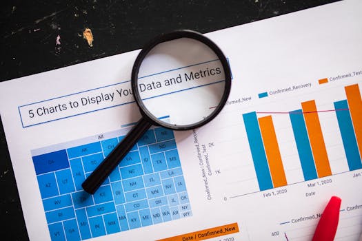
.png)
This article explores best practices tailored specifically to data visualization presentations at conferences and seminars. We’ll cover everything from audience analysis and storytelling techniques to technical logistics and interactive elements, helping you deliver data-driven narratives that resonate.
Understanding Your Audience: Tailoring Visuals for Maximum Engagement
No two conference audiences are alike. Presenters often make the mistake of assuming everyone shares their background or expertise level. A 2023 study by the International Association for Data Visualization found that 74% of audiences believe presenters overestimate their familiarity with the subject matter.
Best practices for audience-centric visualization presentation include:
- Assess Audience Backgrounds: Are attendees mainly technical experts, business leaders, or generalists? For instance, use more detailed scatter plots for technical crowds but opt for simple bar charts for broad audiences. - Align with Conference Theme: Make sure your visuals reinforce the event’s focus, whether it’s innovation, policy, or education. - Use Familiar Visual Formats: Research shows attendees process familiar chart types (bar, line, pie) 1.5 times faster than novel or complex visuals. - Provide Context: Always include brief explanations of axes, units, and data sources. Assume nothing is self-evident. - Pace Appropriately: Plan to explain each visualization in 1-2 minutes, leaving room for questions or clarifications.Crafting a Data Story: Moving Beyond Static Charts
Memorable presentations don't just display data—they tell stories with it. The most effective speakers use data visualizations as narrative anchors, guiding audiences through a logical progression.
Key strategies for building a data story:
- Start with a Question: Frame your talk around a central problem or inquiry. For example, “What factors contributed to the 30% rise in renewable energy adoption in 2023?” - Sequence Visuals: Show data evolution over time, or compare different scenarios. This helps audiences follow the logic step by step. - Annotate for Emphasis: Use callouts, highlights, or arrows to draw attention to key data points. A study by Tableau in 2021 found that annotated charts increased audience recall by 40%. - Tie Back to Real-World Impact: Bridge the gap between abstract data and practical outcomes. For instance, translate a percentage into the number of people affected.Here’s a quick comparison of the impact different storytelling techniques can have on audience retention:
| Storytelling Technique | Average Audience Recall (%) | Engagement Level (1-5) |
|---|---|---|
| Static Data Display | 30 | 2 |
| Sequential Storytelling | 55 | 4 |
| Annotated Visual Narratives | 70 | 5 |
Design for Clarity: Visual Principles That Enhance Comprehension
Even the most insightful data can be lost if the visual presentation is cluttered or confusing. According to research by Nielsen Norman Group, audiences form first impressions of slides in just 3-5 seconds, so clarity is paramount.
Follow these design principles:
- Simplify Color Schemes: Use no more than 3-4 colors per slide. High-contrast palettes improve readability, especially in large rooms. - Maximize Legibility: Use large, sans-serif fonts (at least 24pt). Avoid text over images. - Limit Data Density: Present one main idea per visual. If a chart requires more than 10 seconds to understand, simplify or split it. - Use Visual Hierarchy: Make the most important information the largest or most prominent element. - Avoid “Chartjunk”: Eliminate unnecessary gridlines, 3D effects, and decorative elements that distract from the data.An example: Instead of a dense table of numbers, use a heatmap to highlight trends. Or, swap a crowded multi-line chart for a series of small multiples—one simple line chart per category.
Technical Preparation: Ensuring Flawless Delivery
The best data visualization can’t save a presentation derailed by technical hiccups. With 61% of presenters in a 2022 AVIXA survey reporting at least one technical issue during conferences, preparation is key.
Checklist for technical readiness:
- Resolution Matters: Design visuals for the conference projector’s resolution (often 1920x1080 or lower). Test slides on a similar screen in advance. - Use Universal Formats: Export charts as high-resolution PNG or PDF rather than relying on live links or web-only formats. - Test All Animations: Subtle slide transitions can help, but overuse or incompatible effects can cause delays or crashes. - Embed Fonts and Assets: Ensure custom fonts or external images are embedded so they display correctly on any device. - Bring Backups: Carry your presentation on at least two drives and email yourself a copy.A real-world example: At the 2023 Data Science Summit, presenters who used web-based dashboards saw a 15% higher risk of technical failure compared to those using static images, leading many to switch to hybrid approaches.
Encouraging Interaction: Making Data Visualizations Participatory
Audience engagement is a hallmark of successful conferences. Involving attendees with your data visuals not only sustains attention but also deepens understanding.
Interactive strategies include:
- Live Polling: Use tools like Mentimeter or Slido to let the audience choose which data set to explore next, or to vote on data interpretations. - Question Prompts: Pause after major visuals and pose open-ended questions, e.g., “What trend do you notice here?” This fosters participation and can spark discussion. - Hands-On Demos: For technical conferences, consider demonstrating real-time data filtering or dashboard manipulation. - QR Codes for Download: Place a QR code on your slides linking to interactive versions of your charts, so attendees can explore further after the session. - Feedback Loops: After presenting a visualization, ask for a show of hands or quick reactions to check comprehension and interest.Research by the Conference Board in 2022 found that sessions with interactive elements scored 25% higher in attendee satisfaction.
Adapting Visualizations for Different Presentation Formats
Conference and seminar formats vary widely—from large auditoriums to intimate workshops or hybrid online events. Each setting demands adjustments to how you present your data visuals.
Consider the following adaptations:
- Large Venues: Use bold colors, minimal text, and high-contrast visuals. Avoid small labels or intricate details. - Workshops: Prepare layered visuals, where you can dive deeper into specific data points or reveal more information in response to questions. - Virtual Conferences: Optimize for screen sharing—test how your slides look on small laptop screens. Use tools that allow for real-time annotation or audience chat. - Poster Sessions: Design static visuals that tell a complete story at a glance, with clear legends and concise captions.A 2023 survey by EventMB revealed that 47% of presenters underestimated the need for format-specific adjustments, leading to decreased audience engagement, especially in hybrid settings.
Final Thoughts: Elevating Your Data Visualization Presentations
Presenting data visualizations at conferences and seminars is an art that blends storytelling, design, technical prowess, and audience engagement. By tailoring your visuals to your audience, crafting compelling narratives, prioritizing clarity, preparing for technical hurdles, and encouraging participation, you can transform raw data into memorable, actionable insights.
Remember: the goal isn’t just to display information—it’s to inspire understanding and provoke thought. With careful planning and these best practices, your data visuals can be the highlight of any conference or seminar.