Pie charts are a fundamental tool in data visualization, favored for their simplicity and immediate visual impact. They excel in showing how individual components contribute to a total, making complex information easily understandable at a glance. However, their effectiveness depends heavily on proper usage and understanding when they are the appropriate choice for your data.
Understanding Pie Charts
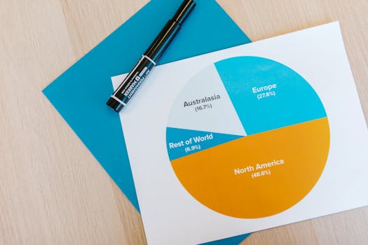
A pie chart is a circular graph where each slice represents a category's contribution to the whole. The size of each slice is proportional to its percentage of the total, with the entire pie chart representing 100%. This type of chart is particularly useful for highlighting proportions and giving a quick snapshot of the distribution within a dataset.
.png)
When to Use Pie Charts
Pie charts are most effective under specific conditions:
- Limited Categories: They are best suited for datasets with a small number of categories — typically five or fewer. This prevents the chart from becoming cluttered and hard to read.
- Comparative Proportions: Ideal for scenarios where you need to emphasize how much each category contributes to the whole, such as in market share visualization or budget allocation.
- Clear Percentage Data: They are most intuitive when the data involves clear, straightforward percentages that audiences can grasp without effort.
When Not to Use Pie Charts
There are certain scenarios where pie charts may not be the best choice:
- Numerous Categories: With too many categories, pie charts become overwhelming and ineffective. Alternatives like bar charts or stacked bar charts might be more appropriate.
- Close Data Points: If the data points are very similar, distinguishing between slices can be challenging, reducing the chart’s clarity.
- Temporal Data: Pie charts are not designed for displaying changes over time. Line graphs or bar charts would better serve such purposes.
Tips for Using Pie Charts Effectively
To maximize the impact of a pie chart, consider these best practices:
- Limit Slices: Keep slices to a minimum to maintain clarity and focus.
- Logical Ordering: Arrange slices either by size, typically in a descending order, or by another logical grouping that aids comprehension.
- Contrasting Colors: Use distinct colors for different slices to differentiate them clearly, but ensure these choices are aesthetically pleasing and do not skew interpretation.
- Clear Labeling: Each slice should be clearly labeled with both the category name and its corresponding percentage. Use a legend if direct labels overcrowd the chart.
- Avoid 3D Effects: Stick to a 2D representation to avoid distortion in how the data is perceived, which can happen with 3D styling.
Conclusion
When used appropriately, pie charts can be an excellent tool for presenting proportional data in a straightforward and visually appealing manner. By knowing when they are suitable and adhering to best practices, you can effectively communicate complex data and make your presentations clearer and more impactful. Remember, the effectiveness of a data visualization lies not just in choosing the right type of chart but also in its design and execution.


