Optimizing Data Visualizations for Mobile Devices: Best Practices for Clarity and Impact
Mobile devices have become the primary platform for consuming digital content. In 2023, over 58% of all website traffic worldwide came from mobile devices, and this number continues to climb. As professionals and general audiences increasingly use smartphones and tablets to access dashboards, reports, and infographics, the importance of optimizing data visualizations for these smaller screens cannot be overstated. Poorly adapted charts and graphs risk obscuring insights, frustrating users, and undermining the value of your visual storytelling.
This article explores the essential best practices for creating data visualizations that shine on mobile devices. We’ll cover responsive design strategies, interactivity, chart selection, accessibility, and real-world testing—all with an eye toward making your visualizations clear, actionable, and engaging for mobile users.
Understanding the Unique Challenges of Mobile Data Visualization
Designing data visualizations for mobile is fundamentally different from desktop or printed formats. The average smartphone screen measures just 5.5 to 6.5 inches diagonally, compared to 13-15 inches for laptops and over 20 inches for desktop monitors. This size difference, combined with touch-based interactions, presents several challenges:
.png) - $1 There’s less room for detailed charts, legends, and text.
- $1 Visualizations must adapt to a wide range of pixel densities and aspect ratios.
- $1 Users tap, pinch, and swipe instead of using a mouse or keyboard.
- $1 Mobile users may experience slower loading times or interruptions.
- $1 There’s less room for detailed charts, legends, and text.
- $1 Visualizations must adapt to a wide range of pixel densities and aspect ratios.
- $1 Users tap, pinch, and swipe instead of using a mouse or keyboard.
- $1 Mobile users may experience slower loading times or interruptions.
A 2022 Nielsen Norman Group study found that users spend 50% less time reviewing content on mobile compared to desktop. This means your visualizations must deliver insights quickly and concisely, with minimal friction.
Responsive Design: Making Visualizations Fluid and Flexible
Responsive design ensures that data visualizations look and function well on any device, regardless of screen size or orientation. The key is to create layouts and graphics that adapt seamlessly to the user’s environment.
$1
1. $1 Use scalable vector graphics (SVG) or Canvas to allow charts to resize based on screen dimensions. 2. $1 Stack or rearrange visual elements vertically for narrow screens. For example, move legends below charts rather than alongside them. 3. $1 Use abbreviations or hide less-important axis labels on smaller screens to reduce clutter. 4. $1 Set specific rules for how charts should appear at different screen widths (e.g., displaying a summary chart on mobile versus a full dashboard on desktop).$1 Google’s Data Studio and Microsoft Power BI both offer mobile view options that automatically adjust chart layouts for different devices.
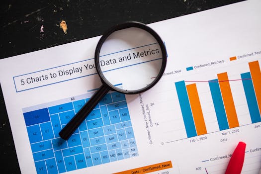
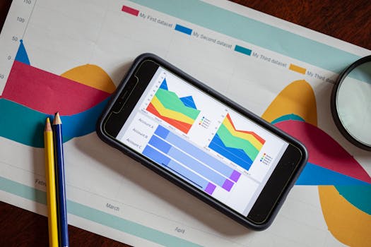
Choosing the Right Chart Types for Mobile Clarity
Not all chart types are equally effective on small screens. Complex visualizations like heatmaps, treemaps, or multi-series line charts can overwhelm mobile users, while simpler formats often communicate data more clearly.
$1
- $1 These are easy to read and interpret, even when condensed. - $1 Useful for showing proportions, but limit the number of segments to avoid crowding. - $1 Miniature line charts that give a quick trend overview without axes or labels. - $1 Effective for showing single metrics or target progress. - $1 Highlight a key metric without any clutter.$1
- $1 Hard to interpret on small screens. - $1 These can become confusing and unmanageable.| Chart Type | Mobile Suitability | Recommended Use |
|---|---|---|
| Bar/Column Chart | High | Comparing discrete categories |
| Pie/Donut Chart | Moderate (max 3-5 segments) | Showing proportions |
| Sparkline | High | Quick trend overview |
| Line Chart | Moderate | Simple trends with few lines |
| Scatterplot | Low | Simple relationships, few points |
| Treemap/Heatmap | Low | Desktop only or with careful simplification |
A 2021 study by Chartio found that mobile users are 30% more likely to correctly interpret single-metric and bar chart visualizations compared to more complex dashboard elements.
Enhancing Interactivity and Usability for Touch Screens
Touch gestures are now the norm for interacting with mobile data visualizations. Ensuring that users can tap, zoom, and explore data seamlessly is critical for engagement and understanding.
$1
- $1 Ensure interactive elements (e.g., buttons, data points) are at least 48x48 pixels to accommodate fingertip input, as recommended by Google’s Material Design guidelines. - $1 Display additional information in pop-up tooltips when users tap or long-press a chart element. - $1 Enable users to zoom into dense data sets or pan across timelines by using familiar gestures. - $1 Avoid requiring multiple taps or complex gestures to access key insights.$1 Apple’s Health app uses simple bar and line charts with interactive elements that expand to reveal details, making efficient use of limited screen space and touch gestures.
Prioritizing Accessibility and Readability
Accessibility is vital for ensuring data visualizations are usable by everyone, including people with visual impairments or color vision deficiencies. On mobile, this means paying special attention to contrast, font size, and color usage.
$1
- $1 Ensure sufficient contrast between data, labels, and backgrounds. Aim for a minimum contrast ratio of 4.5:1 for text, following WCAG 2.1 guidelines. - $1 Use fonts that are at least 12-14px on mobile, and avoid thin or decorative typefaces. - $1 Avoid using color as the sole means of distinguishing data series. Incorporate patterns, shapes, or direct labeling. - $1 Provide descriptive text for charts and interactive elements for users relying on assistive technologies.According to the World Health Organization, at least 1 in 12 men and 1 in 200 women have some form of color vision deficiency. Designing with inclusivity front of mind is both ethically responsible and broadens your visualization’s reach.
Testing and Iteration: Validating Visualizations in the Real World
No matter how carefully you design, real-world usage will reveal unforeseen challenges. Testing your data visualizations on actual mobile devices is essential for fine-tuning performance and usability.
$1
- $1 Test on multiple physical devices (iOS, Android, various screen sizes) to identify layout issues and interaction bugs. - $1 Use browser-based tools to preview how visualizations render on different devices. - $1 Optimize image and data sizes to reduce load times. A Google study found that 53% of mobile users abandon sites that take longer than 3 seconds to load. - $1 Conduct short user tests or surveys to gather feedback on usability, clarity, and engagement.Iterative refinement, based on real feedback and usage data, is the surest path to mobile visualization success.
Maximizing the Impact of Data Visualizations on Mobile Devices
Optimizing data visualizations for mobile isn’t just about shrinking charts to fit a smaller screen. It requires a holistic design approach that considers layout, chart type, interactivity, accessibility, and rigorous testing. By focusing on simplicity, clarity, and touch-friendly functionality, you can ensure your visualizations communicate insights effectively—no matter where your audience is viewing them.
With mobile data consumption only set to increase in the coming years, mastering these best practices will keep your visual storytelling impactful and accessible to all.