Data is at the heart of modern marketing. Marketers invest in analytics tools, track endless metrics, and collect massive amounts of information from campaigns, customer interactions, social media, and more. Yet, the real challenge isn’t gathering data—it’s deciphering it. Hidden patterns in marketing data can reveal untapped opportunities, flag potential risks, and guide smarter, faster decisions. However, sifting through spreadsheets or dashboards often fails to illuminate these insights. This is where data visualization becomes a game-changer. By transforming raw numbers into visual stories, marketers can spot trends, anomalies, and relationships that remain invisible in text-based reports.
The Power of Visual Thinking in Marketing Analytics
Humans process visuals 60,000 times faster than text, according to research from 3M Corporation. This cognitive advantage is crucial when analyzing the complex, multi-channel data that defines modern marketing. Data visualization leverages this power, enabling marketers to see not just what is happening, but why. For example, heatmaps can reveal which sections of a landing page receive attention and which are ignored, while network graphs can uncover influencer communities within social media audiences.
A 2022 Gartner study found that organizations using advanced data visualization tools were 28% more likely to find actionable insights in their marketing data compared to those relying on traditional reporting. By making data accessible, interactive, and visual, teams can collaborate more effectively and make data-driven decisions with confidence.
.png)
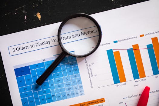
Types of Data Visualizations That Reveal Hidden Patterns
Not all data visualizations are created equal. The effectiveness of a visualization depends on the kind of pattern you’re trying to uncover. Here are several visualization types that are especially powerful for detecting subtle trends and relationships in marketing data:
- $1 Useful for identifying correlations between variables, such as ad spend vs. conversion rate. Outliers, clusters, and linear relationships become immediately visible. - $1 Ideal for visualizing engagement across a website, email campaign, or social post. Heatmaps spotlight areas of high and low activity, often revealing surprising user behaviors. - $1 These highlight the flow of users through a marketing funnel, making it easy to spot where drop-offs occur. - $1 Perfect for uncovering seasonal trends, campaign spikes, or gradual shifts in KPIs over time. - $1 Help visualize hierarchical data, such as campaign performance across multiple channels or product categories.Choosing the right visualization can uncover patterns such as a sudden drop in engagement after a website redesign, a correlation between email send times and open rates, or the emergence of a new customer segment.
Real-World Examples: Discovering Insights with Data Visualization
Let’s look at how leading brands and marketers have leveraged data visualization to uncover hidden patterns and drive results:
1. $1 Netflix uses network graphs to map viewer preferences and identify clusters of similar taste profiles. This visualization approach uncovered that users often enjoy content from multiple, seemingly unrelated genres—insight that led to more effective cross-promotions and increased user engagement. 2. $1 By visualizing social media mentions with heatmaps and word clouds, Coca-Cola detected emerging consumer trends and geographic hotspots. In 2019, this approach revealed a spike in mentions of “sugar-free” in specific regions, prompting targeted campaigns that increased sales by 12% in those markets. 3. $1 Many online retailers use Sankey diagrams to visualize customer journeys. An online clothing retailer discovered, via visualization, that a significant percentage of users were dropping off at the shipping information stage. Further investigation revealed confusing form fields—once fixed, conversion rates increased by 8%. 4. $1 A SaaS company used time series visualizations to track open and click rates over time, spotting a sharp increase in engagement during lunchtime hours. By scheduling future emails for those times, open rates improved from 18% to 26%.These examples illustrate how visualization can reveal patterns that would otherwise remain hidden in rows of data, enabling timely and impactful action.
Comparing Visualization Tools for Hidden Pattern Detection
The choice of a data visualization tool can greatly influence your ability to uncover hidden marketing insights. Here’s a comparison of some of the most popular platforms, focusing on their pattern detection capabilities, ease of use, and integration with marketing data sources:
| Tool | Best For | Pattern Detection Features | Integration with Marketing Data | Ease of Use |
|---|---|---|---|---|
| Tableau | Enterprise-scale analytics | Advanced: clustering, trend lines, forecasting | Direct connectors for Google Analytics, Salesforce, etc. | Moderate (requires training) |
| Looker Studio (formerly Data Studio) | Google ecosystem users | Custom visualizations, blending, data filtering | Seamless with Google Ads, Google Analytics | Easy (drag-and-drop) |
| Power BI | Microsoft-centric organizations | AI-driven pattern detection, anomaly highlighting | Strong integration with Microsoft products | Moderate (learning curve) |
| Qlik Sense | Interactive exploration | Associative data model for hidden relationship discovery | Connects to multiple sources, including CRM and ERP | Moderate |
| Chartio (now part of Atlassian) | Startups & SMBs | Simple visualizations, drill-downs | APIs for marketing platforms | Easy |
Each tool has strengths in different areas. For example, Tableau is renowned for its advanced analytics and ability to uncover clusters of behavior, while Looker Studio excels at blending data from multiple Google sources to spot cross-channel trends.
Common Pitfalls and How to Avoid Them in Marketing Visualization
While data visualization can be transformative, there are common mistakes marketers should avoid to ensure they’re uncovering genuine patterns, not just noise:
- $1 Mistaking random fluctuations for meaningful trends. Always validate patterns with additional data or A/B testing. - $1 Only visualizing metrics that support a preconceived narrative can lead to biased insights. Use comprehensive datasets for a balanced view. - $1 Inconsistent scales can exaggerate or downplay trends. Always use clear, consistent units and label axes accurately. - $1 Visualizations should be accompanied by context—such as campaign timing, market events, or seasonality—that can affect interpretation. - $1 Overly complicated charts can obscure rather than clarify. Simplicity aids comprehension and highlights the most important patterns.By being aware of these pitfalls, marketers can create visualizations that truly illuminate hidden opportunities and risks.
Steps to Turn Data Visualizations into Actionable Marketing Strategies
Data visualization is only valuable if it leads to action. Here’s a step-by-step guide to turning visual insights into marketing success:
1. $1 Know what business question you’re trying to answer. For example, “Why is social media engagement dropping among Gen Z users?” 2. $1 Integrate data from multiple sources—CRM, web analytics, social platforms—for a 360-degree view. 3. $1 Choose a format that best exposes the patterns you seek: heatmaps for engagement, line charts for trends, network graphs for relationships. 4. $1 Use your visualization tool’s features—like clustering or anomaly detection—to identify trends, outliers, or emerging segments. 5. $1 Check if the pattern holds across different timeframes, segments, or with additional data. Avoid acting on spurious findings. 6. $1 For example, if a heatmap shows low attention on a call-to-action button, test a new design via A/B testing. 7. $1 Visualize the results of your changes to see if the desired effect has occurred. Iterate as necessary.Following these steps ensures that your data visualization efforts lead to real, measurable improvements in marketing performance.
Unlocking Marketing Potential: Final Thoughts on Data Visualization
The sheer volume and complexity of marketing data can easily overwhelm even the most seasoned professionals. Yet, within that data lie hidden patterns—connections, trends, and anomalies that can drive competitive advantage. Data visualization serves as a lantern in the dark, illuminating these patterns and empowering marketers to act decisively.
From uncovering unexpected user journeys to detecting shifts in audience sentiment, the right visualizations can spark creativity and innovation. As marketing teams become more data-driven, those who master the art and science of visualization will be best positioned to uncover the insights that shape tomorrow’s winning campaigns.


