In today’s hyperconnected world, social media platforms generate a staggering 2.5 quintillion bytes of data each day. This constant stream includes tweets, likes, shares, comments, videos, and images from billions of users worldwide. For analysts, marketers, and researchers, the sheer volume and complexity of social data is both a goldmine and a challenge. Effective data visualization is the bridge that transforms this raw data into actionable insights, trends, and stories. But how can we harness visualization strategies specifically tailored for social media analysis?
In this article, we’ll explore cutting-edge strategies for visualizing social media data, from mapping viral content and sentiment to tracking network influence and platform comparisons. Whether you’re a social media manager, a data scientist, or simply a curious mind, mastering these visualization tactics can elevate your understanding and impact in the digital age.
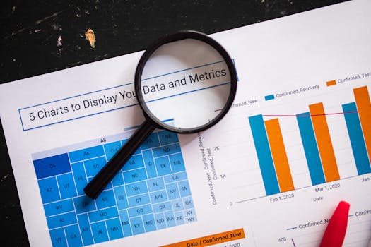
Understanding the Unique Challenges of Social Media Data
Social media data stands apart due to its volume, velocity, and variety. Unlike traditional datasets, social streams are: - Unstructured: Text, images, videos, emojis, and hashtags all mix together. - Real-time: Trends can erupt and fade within minutes. - Contextual: A meme or hashtag might have different meanings across communities.According to a 2023 report by Statista, over 5.17 billion people use social media, with the average user spending 2 hours and 31 minutes daily. This leads to billions of posts each day, making manual analysis impossible.
.png) Key challenges include:
- Noise vs. signal: Distinguishing genuine trends from background chatter.
- Multilingual content: Social platforms connect global audiences.
- Network complexity: Interactions span individuals, brands, and bots.
Key challenges include:
- Noise vs. signal: Distinguishing genuine trends from background chatter.
- Multilingual content: Social platforms connect global audiences.
- Network complexity: Interactions span individuals, brands, and bots.
To overcome these obstacles, visualization must go beyond simple charts. It should reveal connections, sentiment, and key influencers at a glance.
Mapping Virality: Visualizing Content Spread
One of the most exciting aspects of social media is how content—be it a tweet, video, or hashtag—can go viral. But what does virality look like, and how can it be visualized?
$1
Cascade trees are a popular strategy for mapping how content spreads. Each node represents a user, and edges show who shared content with whom. For example, a single tweet that gets retweeted hundreds of times can be visualized as a tree with many branches, revealing the depth and breadth of its spread.
A 2022 MIT study found that viral tweets typically form deep, branching trees, while regular tweets resemble shallow, narrow trees. This method highlights not just how many people saw the content, but how far it traveled from its origin.
$1
Heatmaps can show when and where a hashtag or campaign is most active. For instance, if a brand launches a marketing campaign, a heatmap may reveal that engagement spikes at 8pm in New York and noon in London, suggesting optimal posting times for future content.
Sentiment Analysis: Turning Opinions into Visual Insights
Social media is a rich tapestry of opinions, emotions, and conversations. Visualizing sentiment—how users feel about a brand, event, or topic—can uncover hidden patterns and public mood shifts.
$1
Plotting sentiment over time is a powerful way to track public reaction. For example, during a product launch, a time series line chart could show how positive, negative, and neutral mentions change hour by hour.
In 2020, a global beverage brand used sentiment time series to monitor a controversial ad campaign. Negative sentiment spiked within the first 6 hours, prompting a rapid response and damage control, ultimately reducing negative mentions by 40% over the next 24 hours.
$1
Emoji clouds can visualize the most frequently used emojis in a conversation, offering a quick snapshot of mood. Polarity maps, meanwhile, use color to indicate positive, neutral, or negative sentiment across different regions or user demographics.
Network Analysis: Uncovering Influencers and Communities
Beyond individual posts, social media is a web of relationships. Network analysis visualizations reveal how users connect, influence, and form communities.
$1
By plotting users as nodes and their interactions as edges, analysts can identify “hubs”—people or accounts with disproportionate influence. An influencer map might show that while a celebrity has millions of followers, a micro-influencer in a niche community drives more engagement for certain topics.
In a 2021 Twitter analysis, it was found that 2% of users generated over 60% of retweet activity during major news events. Visualization made it possible to identify these key players quickly.
$1
Cluster graphs use colors and spatial grouping to reveal communities within a network. For example, during a global sports event, clusters might form around fans of different teams or regions. This helps brands tailor content and engagement strategies for each group.
Platform Comparison: Visualizing Cross-Channel Performance
Social media campaigns often span multiple platforms—Instagram, Twitter, Facebook, TikTok, and more. Comparing performance across these channels is crucial for optimizing strategy.
$1
An effective strategy is to use dashboards that juxtapose key metrics—likes, shares, comments, reach—across platforms. This could be visualized as a series of bar charts, or more interactively as a comparison table.
Below is an example table comparing engagement metrics for a hypothetical campaign across three major platforms:
| Platform | Total Posts | Average Engagement Rate (%) | Top Performing Content Type | Peak Activity Time |
|---|---|---|---|---|
| 150 | 5.4 | Stories | 7:00 PM | |
| 200 | 3.1 | Tweets with Hashtags | 1:00 PM | |
| 120 | 2.8 | Video Posts | 8:00 PM |
Such tables help stakeholders quickly spot where the campaign is thriving and where adjustments are needed. For instance, higher engagement on Instagram Stories might suggest shifting budget and creative resources there.
Real-Time Dashboards: Visualizing Live Social Trends
In the fast-paced social media environment, timing is everything. Real-time dashboards allow teams to monitor live trends, track campaign performance, and respond instantly to emerging issues.
$1
Platforms like TweetDeck, Hootsuite, or custom dashboards built with tools like Tableau or Power BI can display streaming data—mentions, hashtags, sentiment, and more—as it happens. For example, during a live event, a real-time line graph could show the volume of mentions per minute, alerting teams to sudden spikes.
$1
Integrating visual alerts—such as color-coded warnings when negative sentiment exceeds a threshold—enables proactive management. During crises, these visual cues allow brands to intervene before issues escalate.
Storytelling with Social Media Data: From Numbers to Narratives
Numbers alone rarely inspire action. The most effective visualizations weave data into stories that resonate with audiences, stakeholders, or the public.
$1
A well-crafted report might combine a cascade tree (to show how a hashtag spread), a sentiment time series (to illustrate public reaction), and influencer maps (to highlight key voices). Together, these visuals build a compelling narrative about what happened, who drove the conversation, and how the public felt.
$1
During the 2022 #ClimateAction movement, analysts combined geo-tagged heatmaps, sentiment time series, and community detection graphs to reveal: - The movement’s growth from local to global. - Key influencers driving the conversation in different countries. - Shifts in sentiment following major policy announcements.This holistic approach provided actionable insights for NGOs, policymakers, and media outlets.
Best Practices for Effective Social Media Data Visualization
To maximize the impact of your visualizations, consider these best practices: - $1 Always provide context—what’s being visualized, over what period, and why it matters. - $1 Use interactive dashboards to allow users to filter by platform, time, or demographic. - $1 Avoid clutter. Highlight key trends and insights rather than overwhelming with too many details. - $1 Ensure color choices and text are accessible to all audiences, including those with visual impairments. - $1 Regularly update visuals and seek feedback to ensure they meet stakeholder needs.According to a 2023 Nielsen Norman Group study, interactive, context-rich data visualizations improve retention and decision-making by up to 82% compared to static charts.
Unlocking the Power of Social Media Data Visualization
Social media data is vast and ever-changing, but with the right visualization strategies, its complexity can be transformed into clarity and action. From mapping viral content and tracking sentiment to uncovering influencer networks and comparing platform performance, each visualization technique offers unique insights. The most effective approaches blend multiple strategies, crafting compelling visual narratives that drive real-world decisions.
As social platforms evolve and data volumes grow, staying at the forefront of visualization tools and techniques will be essential for anyone looking to understand and leverage the power of social conversation.


