How to Improve Data Visualization Interactivity through User Feedback
Data visualization is a powerful way to make complex information digestible and actionable. But as organizations lean more on visuals to communicate data-driven insights, interactivity becomes essential. Interactive visualizations let users explore, filter, and engage with data directly, boosting understanding and retention. However, designing interactivity that truly resonates with users requires more than intuition—it demands feedback from those who use these visualizations daily.
In this article, you'll discover how incorporating user feedback can transform your data visualizations from static images to dynamic tools, fostering deeper engagement and insight. We'll examine best practices, real-world examples, and practical strategies for gathering, integrating, and iterating based on user feedback. By the end, you'll have a clear roadmap to elevate your interactive visualizations—and make them genuinely user-centric.
The Importance of User Feedback in Interactive Data Visualization
User feedback is the cornerstone of any successful interactive data visualization. While designers and data scientists can make educated guesses about user needs, only the end users themselves can tell you what works—and what doesn't. According to a 2022 study by Tableau, 67% of organizations reported higher satisfaction and usability scores for dashboards that incorporated regular user feedback cycles.
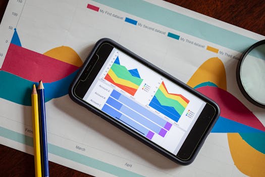
.png)
Feedback uncovers pain points, usability hurdles, and overlooked features. For example, users might struggle to find filter options, misinterpret color-coded data, or desire drill-down capabilities that were never considered. Without their input, even the most sophisticated interactive features can become sources of confusion rather than clarity.
Key benefits of leveraging user feedback include: - Improved usability and engagement - Enhanced trust in visualized data - Faster iteration and innovation cycles - Greater alignment with organizational goalsIn essence, user feedback transforms interactive data visualization from a one-way communication into a collaborative, evolving conversation.
Methods for Collecting User Feedback on Data Visualizations
Effective feedback collection is both an art and a science. The right methods depend on your audience, visualization platform, and available resources. Here are some proven techniques:
1. $1: Incorporate feedback buttons or surveys directly within your visualization dashboard. These allow users to submit comments at the moment they encounter problems or have suggestions. 2. $1: Invite representative users to perform specific tasks using your interactive visuals while observing their actions and gathering real-time feedback. According to the Nielsen Norman Group, even five users can uncover 85% of usability issues. 3. $1: Tools like Google Analytics or Hotjar can track where users click, how they interact with filters, and where they drop off. For example, if data shows that only 10% of users interact with a particular control, it may need redesign or better visibility. 4. $1: In-depth conversations provide nuanced insights you can't get from quantitative data alone. Ask users what they find confusing, what features they wish existed, and how visualizations fit into their workflow. 5. $1: Schedule periodic check-ins (monthly or quarterly) to solicit feedback, especially after updates or new feature releases.Here's a comparison of common feedback collection methods:
| Method | Strengths | Weaknesses |
|---|---|---|
| Embedded Widgets | Real-time, high volume, easy integration | May lack context, risk of generic feedback |
| Usability Testing | Detailed, direct observation, actionable | Time-intensive, smaller sample size |
| Analytics Tracking | Quantitative, identifies usage patterns | No direct user intent or sentiment |
| User Interviews | Rich insights, clarifies user goals | Resource-intensive, subject to bias |
| Regular Surveys | Scalable, easy to repeat | Lower response rates, may miss specifics |
Most effective data visualization teams use a mix of these approaches to capture both the breadth and depth of user experience.
Translating Feedback into Actionable Improvements
Collecting feedback is just the first step. The real impact comes from turning insights into concrete improvements. Here’s how to close the loop:
1. $1: Organize comments and suggestions by themes—navigation, color schemes, filter usage, data clarity, etc. This makes it easier to spot patterns and prioritize enhancements. 2. $1: Not all feedback is equally urgent or feasible. Use a prioritization framework such as the Impact/Effort matrix to decide which issues to address first. For example, if multiple users struggle with a dropdown filter, fixing it should outrank requests for new chart types. 3. $1: Implement changes in a test environment and share prototypes with users for further feedback before full deployment. This iterative approach, known as "design thinking," is credited by IDEO with reducing development time by 30% in digital projects. 4. $1: Let users know which changes were made based on their feedback. This transparency builds trust and encourages future participation.A real-world example comes from a financial services firm that revamped its sales dashboard after user feedback highlighted confusion around filtering options. By simplifying filter labels and adding tooltips, the team saw a 40% reduction in support requests and a 25% increase in dashboard adoption.
Best Practices for Sustaining User-Centric Interactivity
To make user feedback an integral—and ongoing—part of your interactive data visualization process, consider these best practices:
- $1: Make it easy and routine for users to share their thoughts. Consider quarterly surveys, a visible “Feedback” button, or even a dedicated user group. - $1: Engage real users during the prototype phase, not just after launch. Early input reduces costly redesigns later. - $1: Keep a record of what changes were made and why. This helps align stakeholders and provides a knowledge base for future projects. - $1: Use metrics such as time-on-dashboard, feature adoption rates, and user satisfaction scores to evaluate the effect of changes. - $1: Encourage openness to criticism and reward constructive suggestions. Microsoft, for instance, credits its “customer obsession” feedback model with helping shape user-friendly features in its Power BI platform.According to a 2023 survey by DataViz Weekly, organizations with structured feedback loops improved user satisfaction with interactive dashboards by an average of 18% compared to those without.
Challenges and Solutions in Implementing Feedback-Driven Interactivity
While the benefits of user-driven design are clear, there are common challenges:
- $1: Too many suggestions can overwhelm teams. Solution: Use voting systems or prioritization frameworks to focus on high-impact items. - $1: Different users may want opposing features. Solution: Align decisions with organizational goals and use user personas to guide compromises. - $1: Time and budget constraints may limit how much feedback you can implement. Solution: Start small, focusing on quick wins that deliver outsized value, and build momentum over time.One global retailer faced conflicting requests for its inventory dashboard—some wanted more granular controls, others preferred simplicity. By segmenting users and offering customizable views, the team satisfied both groups and improved overall engagement by 22%.
Future Trends: User Feedback and the Next Generation of Interactive Visualizations
The future of data visualization is increasingly user-driven. Advances in AI and machine learning are enabling real-time personalization based on user behavior and feedback. For example, platforms like Tableau and Power BI are experimenting with AI-powered “insight suggestions” that adapt to individual preferences, while open-source libraries like Plotly Dash now support automated feedback tracking.
Voice-activated feedback, natural language queries, and adaptive interfaces are on the horizon. Gartner predicts that by 2026, 50% of business users will interact with data visualizations primarily through conversational interfaces, making real-time feedback even more critical.
As the technology evolves, the organizations that thrive will be those that treat user feedback as a continuous, strategic asset—not a one-time checkbox.
Unlocking the Full Potential of Data Visualization through User Feedback
Interactive data visualizations are only as effective as their ability to meet real user needs. By systematically gathering, analyzing, and acting on user feedback, you can turn your dashboards and reports into indispensable tools that drive understanding, action, and business success.
From choosing the right feedback collection methods to building a feedback-driven culture, every step you take brings your data visualizations closer to true user-centricity. In a world where data is everywhere but insight is rare, user-driven interactivity is your competitive edge.