The Science and Art of Data Visualization
Data visualization sits at a unique intersection between scientific rigor and creative expression. As our world becomes increasingly data-driven, the ability to translate complex datasets into clear, compelling visuals has become an essential skill across industries. Yet, effective data visualization is not just about making charts look attractive; it’s about leveraging both scientific principles and artistic sensibilities to reveal insights, influence decisions, and inspire action.
This article explores the dual nature of data visualization—its scientific foundations and its artistic dimensions. We will delve into why this combination matters, how different approaches shape outcomes, and examine striking real-world examples. Whether you’re a business leader, educator, designer, or simply data curious, understanding the science and art behind data visualization will transform how you see and share information.
The Scientific Foundations of Data Visualization
At its core, data visualization is grounded in science. It draws on research from fields such as cognitive psychology, statistics, and computer science to guide how information is presented and perceived.
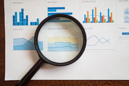
.png)
One critical scientific aspect is how the human brain processes visual information. According to studies, nearly 50% of our brain is involved in visual processing, and 70% of our sensory receptors are in our eyes. Humans process images 60,000 times faster than text, which makes visualization a potent tool for communication.
Key scientific principles in data visualization include:
- $1 Certain chart types (like bar graphs) are scientifically proven to convey quantitative differences more accurately than others (like pie charts). - $1 Visualizations must not distort the underlying data. Edward Tufte, a pioneer in the field, emphasizes minimizing “chartjunk”—unnecessary or misleading elements that can confuse viewers. - $1 Simpler visualizations reduce cognitive effort, enabling faster comprehension. The Gestalt principles of perception—such as proximity, similarity, and continuity—explain how viewers naturally group and interpret visual elements.Research from Massachusetts Institute of Technology (MIT) shows that well-designed visualizations can improve data comprehension by up to 400%. This underscores the scientific importance of choosing the right format and following evidence-based design principles.
The Artistic Dimension: Creativity and Storytelling
While science ensures accuracy and clarity, art brings imagination and emotional resonance to data visualization. Artistic choices—color palettes, composition, typography, and narrative structure—can transform dry data into engaging stories.
Consider the use of color: Color theory, borrowed from the art world, helps set the mood, draw attention, and encode information. For example, a 2022 Nielsen Norman Group report found that strategic use of color can increase chart interpretability by 25%.
Storytelling is another artistic element. By crafting a narrative arc—an introduction, rising action, climax, and resolution—data visualizers guide viewers through the data, highlighting key takeaways and encouraging deeper engagement. Infamous examples like Florence Nightingale’s “coxcomb” charts or the New York Times’ interactive COVID-19 maps demonstrate how compelling storytelling can turn statistics into social change drivers.
Artistic flair also enables innovation. From hand-drawn sketches to immersive 3D environments, creative approaches can make data more memorable and accessible, especially for non-expert audiences.
Choosing the Right Visualization: Science vs. Art
Selecting the appropriate visualization method often involves balancing scientific accuracy with artistic impact. The table below compares common visualization types, highlighting the trade-offs between scientific rigor and artistic expression.
| Visualization Type | Best For | Scientific Strengths | Artistic Opportunities |
|---|---|---|---|
| Bar Chart | Comparing values | High accuracy, easy to interpret | Limited, but can use bold colors and labels |
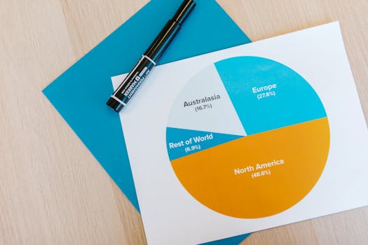
| Pie Chart | Showing proportions | Lower accuracy, can be misleading | Visually appealing, good for simple data |
| Scatter Plot | Relationship between variables | Excellent for patterns and correlations | Can use color/size for extra dimensions |
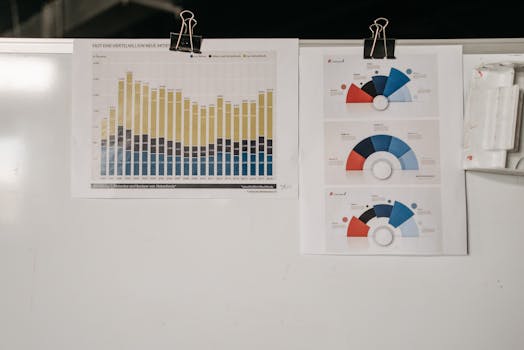
| Heatmap | Showing intensity | Conveys large datasets effectively | Vivid color gradients, intuitive design |
| Infographic | Summarizing complex info | Varies, risk of oversimplification | High creative freedom, storytelling |
The table demonstrates that while bar charts and scatter plots score high on scientific accuracy, infographics and heatmaps offer more room for artistic interpretation. The right choice depends on the data, audience, and intended message.
Real-World Impact: Case Studies in Science and Art
Data visualization’s blend of science and art is evident in some of the world’s most influential visualizations.
1. $1 Often cited as the first modern data visualization, Snow’s map of London’s cholera outbreak used scientific mapping and clear iconography to reveal the source of contamination—a water pump on Broad Street. This changed public health forever, proving the power of clear, evidence-based visuals. 2. $1 In the 2000s, Swedish statistician Hans Rosling popularized animated bubble charts to illustrate trends in global health and economics. His presentations combined rigorous data analysis with dynamic, colorful visuals—making complex trends relatable and memorable. 3. $1 This interactive, real-time map of wind patterns across the U.S. merges meteorological data with elegant visual flows. The beauty of the design invites exploration, while the accuracy of the science informs weather analysis and public awareness.These examples show that when science and art converge, data visualizations can inform policy, change behavior, and even save lives.
Challenges and Ethical Considerations
Like any powerful tool, data visualization has its pitfalls. Combining scientific and artistic elements requires careful navigation to avoid misleading or confusing viewers.
- $1 Poor design choices—such as truncated axes, deceptive color scales, or cherry-picked data—can intentionally or unintentionally distort the message. A 2017 Harvard study found that 38% of surveyed business executives had been misled by poorly designed charts. - $1 Artistic embellishments can add value, but too much decoration can create “chartjunk,” distracting from the core message. Clarity should always trump style. - $1 Scientific rigor should extend to accessibility. Visualizations must consider color blindness (affecting 1 in 12 men and 1 in 200 women), screen readers, and other diverse needs. The Web Content Accessibility Guidelines (WCAG) offer practical standards for inclusive design. - $1 Artistic storytelling should never override factual accuracy. Data selection, annotation, and context must serve the truth, not just a narrative or agenda.The Future: Integrating AI and Interactivity
As data grows more complex, the science and art of visualization are evolving rapidly. One major trend is the integration of artificial intelligence (AI) and interactive technologies.
AI-driven tools, such as Tableau’s “Explain Data” or Microsoft Power BI’s “Smart Narratives,” automatically suggest visualizations and highlight insights, reducing the skill barrier for non-experts. According to Gartner, by 2025 over 80% of data visualization will be augmented by AI.
Interactivity is another leap forward. Dynamic dashboards, real-time data feeds, and immersive experiences (like AR/VR) enable users to explore data on their own terms. This increases both engagement and comprehension, blending scientific analysis with artistic exploration.
As technology advances, the challenge will be to maintain the delicate balance between scientific accuracy and artistic creativity—ensuring that visualizations remain clear, ethical, and impactful.
Conclusion
The science and art of data visualization together form a powerful language for our data-rich era. By respecting scientific principles—accuracy, clarity, integrity—and embracing artistic techniques—color, composition, storytelling—visualizations can illuminate hidden patterns, inspire action, and foster understanding.
Whether you’re designing a business dashboard, teaching students, or sharing insights with the world, remember that the best data visualizations are those that blend the precision of science with the imagination of art. This dual approach not only makes data more accessible but also ensures it has the power to inform, persuade, and transform.