When presenting data, choosing the right visualization is crucial for clear communication. Pie charts and bar graphs are two popular chart types, each suited for specific data types and presentation needs. Understanding their strengths helps in effectively conveying information.
Pie Charts: Ideal for Proportional Data
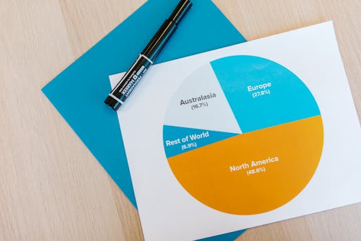
Pie charts excel at displaying proportions and percentages, making them perfect for visualizing parts of a whole. For instance, if you're illustrating the market share of a product across different regions, a pie chart shows how each region contributes to the total, with each slice representing a different region. This visual setup helps viewers quickly grasp which areas have higher or lower shares.
.png)
However, pie charts are less effective with many categories, as small slices can be hard to distinguish. They also struggle to depict changes over time. For datasets with more than five categories or for showing trends, consider using a bar graph.
Bar Graphs: Flexible and Comparative
Bar graphs are versatile, suitable for comparing different groups, tracking changes over time, or showing proportions. They can be oriented horizontally or vertically and manage multiple data categories efficiently.
A key advantage of bar graphs is their comparative clarity. For example, comparing product sales across several quarters is straightforward with a bar graph, as it allows for easy comparison of bar heights or lengths. Bar graphs can also be configured as grouped or stacked, offering a comprehensive view of data like total sales by product type and region in a single visualization.
Choosing the Right Chart
Selecting between a pie chart and a bar graph depends on your specific communication needs:
- Pie Chart:
- Ideal for illustrating parts of a whole.
- Best with fewer categories.
- Useful for highlighting proportions or percentages.
- Bar Graph:
- Better for comparing quantities among different groups.
- Suitable for time series data or showing changes over time.
- Effective with complex or multiple data sets.
SEO Considerations for Visualization Content
Optimizing content about data visualization for search engines helps in reaching a wider audience. Consider these SEO tips:
- Incorporate relevant keywords such as “data visualization,” “pie charts vs bar graphs,” and “best chart for data.”
- Write clear, accessible content, favored by search engines for adding reader value.
- Use alt text for charts or graphs, describing their content. This improves SEO and accessibility.
In summary, both pie charts and bar graphs are effective data visualization tools, each with distinct advantages. Choosing the appropriate chart depends on the data nature and the intended message, ensuring the information is digestible and engaging. Proper selection leads to impactful data presentations, simplifying complex information for your audience.