Pie Charts: A Simple Yet Powerful Tool for Data Analysis
Pie charts have become a staple in the world of data visualization, known for their simplicity and immediate impact. Whether you’re a business analyst, educator, or simply trying to make sense of survey results, pie charts are often the go-to tool for comparing parts of a whole at a glance. But what makes pie charts so effective, and where do their true strengths — and limitations — lie? In this article, we’ll explore the enduring popularity of pie charts, examine their best use cases, and compare them with other visual tools. We’ll also look at real-world examples, their psychological impact, and tips for maximizing their clarity and effectiveness.
The Enduring Appeal of Pie Charts in Data Analysis
Since their invention by Scottish engineer William Playfair in 1801, pie charts have stood the test of time in the world of data visualization. Their circular format, divided into proportional slices, offers a visually intuitive way to represent how categories contribute to a whole. According to a 2023 survey by Data Visualization Society, over 58% of professionals still use pie charts regularly in reports, presentations, and dashboards. Their appeal is rooted in simplicity: with just a glance, viewers can identify major segments and overall proportions without needing to interpret complex axes or legends.
The primary reason for their popularity is cognitive ease. Research published in the Journal of Vision (2017) found that people can accurately estimate proportions in a pie chart up to about five slices, making them ideal for datasets with limited categories. For instance, representing quarterly sales breakdown or demographic distribution becomes instantly digestible with a pie chart.
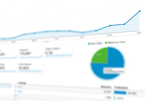
.png)
Best Use Cases: When to Use a Pie Chart
Pie charts are most effective when you want to:
1. Show parts of a whole: Display how a single dataset is divided into categories, such as market share or budget allocation. 2. Emphasize proportions: Quickly reveal dominant categories or highlight small contributors. 3. Present simple data: Use datasets with fewer than six categories for optimal clarity and impact.Some common applications include:
- Market Share Analysis: Illustrating how different brands occupy portions of a market. - Budget Breakdown: Showing how organizational funds are distributed across departments. - Demographic Data: Visualizing the age or gender composition of a group.Let’s take a real-world example. Imagine a survey of 1,000 smartphone users on their preferred operating system:
- Android: 580 users - iOS: 320 users - Other: 100 usersA pie chart instantly shows Android’s dominance, making it easier to grasp than a table of raw numbers. This quick comprehension is why pie charts are favored in executive summaries and public-facing reports.
However, experts caution against using pie charts for complex datasets or when differences between categories are subtle. For such cases, bar charts or line graphs may provide better precision.
Comparing Pie Charts to Other Visualization Tools
While pie charts excel at representing simple proportions, they’re not always the best choice. Here’s a comparison table to illustrate how pie charts stack up against bar charts and stacked bar charts:
| Feature | Pie Chart | Bar Chart | Stacked Bar Chart |
|---|---|---|---|
| Best for | Showing parts of a whole (few categories) | Comparing values across categories | Comparing parts of multiple wholes |
| Max Categories | 3-6 (ideally) | 10+ | 5-10 (per bar) |
| Ease of Comparison | Good for proportions, less for precise values | Excellent for comparing exact values | Good for group and segment comparisons |
| Space Efficiency | High for simple data | Moderate | Moderate to low |
| Visual Appeal | High (intuitive, engaging) | Moderate | Moderate |
In summary, choose a pie chart for straightforward proportional data and a bar chart when you need to compare exact values or handle more categories.
The Psychology Behind Pie Charts: Why Our Brains Love Circles
The human brain is wired to recognize shapes and patterns quickly. Circles, in particular, draw the eye and are associated with harmony and unity. Pie charts leverage this by presenting data as slices of a familiar whole. Psychologists have found that viewers process circular graphs up to 30% faster than rectangular ones for simple part-to-whole comparisons (International Journal of Human-Computer Studies, 2021).
This visual advantage is especially important in business and education, where decision-makers often scan reports quickly. A well-designed pie chart can highlight a critical data point — like a sudden spike in expenses or a market leader’s dominance — in less than two seconds.
However, the same psychological ease can lead to misinterpretation if the chart is overloaded or poorly labeled. For example, viewers may overestimate the size of slices positioned at the top of a pie chart due to a phenomenon called the "top-slice bias." Therefore, clarity and simplicity are crucial when designing an effective pie chart.
Designing Effective Pie Charts: Best Practices and Common Pitfalls
While pie charts are straightforward, a few best practices ensure they remain effective communicators:
1. Limit the Number of Slices: Aim for no more than five or six categories. If you have more, group smaller segments as "Other." 2. Use Distinct Colors: Ensure each slice is easily distinguishable, especially for viewers with color vision deficiencies. About 8% of men and 0.5% of women have some form of color blindness (Color Blind Awareness). 3. Label Clearly: Each slice should have either a direct label or a clear legend. Avoid relying solely on color. 4. Start at 12 O’clock: Place the largest slice at the top (12 o’clock position) and proceed clockwise. 5. Avoid 3D Effects: Studies show 3D pie charts distort perception, making it harder to judge slice sizes accurately.Let’s illustrate with an example. Suppose you’re presenting a company’s expense breakdown:
- Salaries: 40% - Marketing: 25% - Research: 20% - Operations: 10% - Other: 5%A clean, flat pie chart with bold labels and contrasting colors allows viewers to immediately see where the bulk of expenses lie. Conversely, a chart with 10+ thin slices, unclear labels, or excessive use of gradients can confuse rather than clarify.
Real-World Examples of Pie Charts in Action
Pie charts are used across various industries to distill complex data into accessible insights. Here are a few notable examples:
- Public Health: The World Health Organization often uses pie charts to illustrate vaccination coverage or disease prevalence by region. In their 2022 report, a pie chart showed that 65% of the global population had received at least one dose of a COVID-19 vaccine, with breakdowns by continent. - Business: In an annual report, a tech company displayed its revenue streams via a pie chart: 55% from software, 30% from services, and 15% from hardware. This visual made it clear at a glance where the company’s core strength lay. - Education: Teachers use pie charts to help students understand fractions and percentages. A classroom survey might reveal that 60% of students prefer online learning, 30% prefer in-person, and 10% have no preference — a pie chart makes this data instantly relatable.These examples underscore the versatility of pie charts in making data more approachable and actionable for broad audiences.
Pitfalls to Avoid: When Not to Use a Pie Chart
Despite their strengths, pie charts are not the answer to every data visualization need. Here are situations where another chart type may be better:
- Too Many Categories: If you have more than six categories, slices become too thin to interpret, and a bar chart will be clearer. - Tracking Changes Over Time: Pie charts don’t display trends well. Use line or column charts for time-based data. - Small Differences: When differences between values are slight, viewers may struggle to distinguish slice sizes. A bar chart provides better accuracy. - Negative or Zero Values: Pie charts cannot represent negative numbers or zero values, as each slice must be a positive proportion of the total.A 2020 study by the Data Visualization Research Lab found that only 18% of viewers could accurately rank five similar-sized pie chart slices, compared to 79% accuracy with bar charts. This highlights the importance of using pie charts only when they play to their strengths: simplicity and clear proportional relationships.
Pie Charts in the Digital Age: Interactive and Animated Uses
With the rise of interactive dashboards and online reports, pie charts have evolved beyond static images. Tools like Tableau, Power BI, and Google Charts allow for dynamic pie charts where users can hover over slices to see data values, filter by categories, or even animate changes over time.
This interactivity enhances engagement and understanding. For example, a marketing dashboard might feature a pie chart showing customer segments. Clicking on a slice reveals further details about that segment, such as purchase behavior or geographic distribution. Studies show that interactive charts increase information retention by up to 25%, according to a 2022 report by the Nielsen Norman Group.
Animated pie charts can also help audiences visualize shifts in data, such as changes in market share or budget allocations year over year. This brings a new layer of storytelling to data analysis, making pie charts not only simple but also powerful tools for modern data communication.
Pie Charts: A Timeless Tool with Enduring Value
Pie charts have earned their place as one of the simplest yet most effective tools for data analysis. Their ability to turn numbers into visual stories makes them invaluable for conveying proportions, highlighting key segments, and engaging diverse audiences. While they are not suitable for every data scenario, their clarity and immediacy remain unmatched for datasets with a small number of categories.
Understanding when and how to use pie charts — and when to opt for another visualization — is crucial for anyone looking to communicate data clearly. By following best practices and leveraging modern interactive features, you can ensure your pie charts remain both simple and powerful in the evolving world of data analysis.


