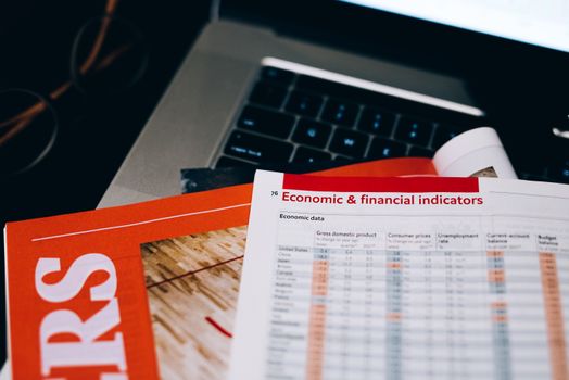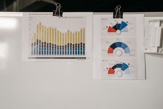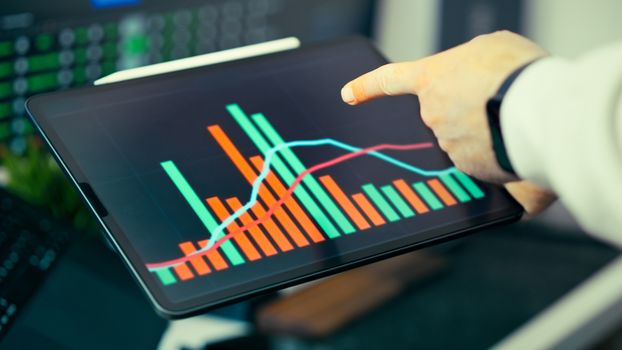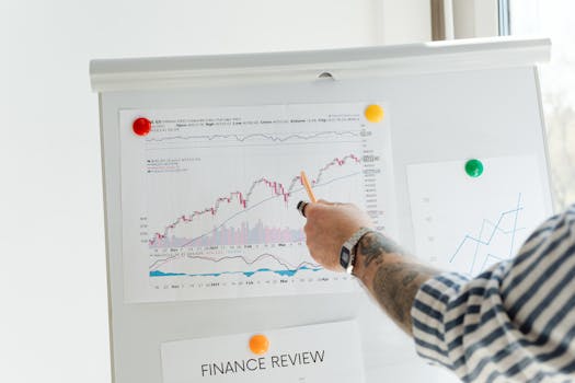
Interpreting economic data is a vital skill in today’s information-driven world, where charts and graphs often shape our understanding of complex financial realities. But as powerful as data visualizations are, misreading them can lead to costly errors and misguided decisions. Whether you’re a student, policymaker, business leader, or simply a curious citizen, knowing how to correctly interpret data from economic visualizations is essential for drawing accurate conclusions and making informed choices. This guide demystifies the process, highlights common pitfalls, and gives you practical tools to become a more discerning data reader.
The Role of Data Visualizations in Economic Analysis
Economic analyses frequently involve vast amounts of raw data—think GDP growth rates, unemployment figures, trade balances, and inflation indices. Visualizations such as line graphs, bar charts, scatter plots, and heatmaps distill this information, making trends and patterns more accessible. According to a 2022 survey from the Data Visualization Society, 89% of economists and analysts reported using graphical representations as their primary means to communicate data-driven findings.
Visualizations serve several functions in economics: - They reveal trends over time (e.g., how GDP changed over a decade). - They facilitate comparisons (such as between different countries or sectors). - They highlight outliers or anomalies (like a sudden spike in unemployment).But, as with any tool, the value of a visualization depends on how it’s interpreted. Misreading a chart can lead to overestimating economic growth, underestimating inflation, or misunderstanding the impact of a policy.
.png)
Understanding Visualization Types and Their Limitations
Different visualizations are suited to different kinds of economic analysis. Here’s a quick overview comparing common chart types and what they do best:
| Chart Type | Best Use Case | Potential Pitfall | Example in Economics |
|---|---|---|---|
| Line Graph | Showing trends over time | Can exaggerate trends with manipulated scales | GDP growth over years |
| Bar Chart | Comparing quantities between groups | Bar width or 3D effects can distort perception | Unemployment rates by country |
| Scatter Plot | Showing relationships between variables | Correlation does not imply causation | Inflation vs. unemployment (Phillips curve) |
| Heatmap | Displaying density or intensity across categories | Color choices can mislead or obscure differences | Trade intensity between countries |
Recognizing the strengths and limitations of each type helps you assess the reliability and intent behind the visualized data. For example, a 3D bar chart might look impressive on a presentation slide but can make it hard to compare bar heights accurately, leading to misinterpretation.
Decoding Axes, Scales, and Baselines
One of the most common sources of misinterpretation in economic charts is the manipulation of axes or scales. A small tweak in how data is presented can have a dramatic impact on how viewers perceive the story.
For example, a 2020 study by the American Economic Association found that 37% of economic news charts used non-zero baselines, which can exaggerate minor changes and make them seem more significant than they are. When a bar chart starts its Y-axis at 50 instead of 0, a rise from 51 to 52 appears enormous, although it's only a 2% increase.
Similarly, logarithmic scales are often used to represent exponential growth (like compound interest or pandemic infection rates). While this can make fast-growing data easier to compare, readers must understand that equal spacing on the axis does not represent equal increases in real terms.
Always check: - Does the axis start at zero? - Is the scale linear or logarithmic? - Are intervals evenly spaced? - Are both axes clearly labeled with units (billions vs. millions, percent vs. absolute numbers)?By scrutinizing these details, you can avoid being misled by charts that unintentionally—or intentionally—distort the underlying data.
Identifying Context and Avoiding Cherry-Picking
No economic visualization exists in a vacuum. The context in which data is presented is crucial. For instance, a chart showing a country's GDP decline over a single quarter may appear alarming, but zooming out to a ten-year trend could reveal it as a minor blip in a period of overall growth.
Cherry-picking is a common issue, where only a selective time frame or data subset is shown to support a particular narrative. In 2019, a widely-circulated chart purported to show a “collapse” in manufacturing jobs in the US by focusing solely on the years 2008-2009, omitting the recovery and stabilization that followed.
When interpreting data visualizations in economics, always ask: - What time period is covered, and is it representative? - Are there missing variables or categories? - Was the data source reputable and transparent? - Does the chart compare apples with apples—e.g., inflation-adjusted figures, per capita rates, or absolute numbers?Understanding the broader context helps prevent misinterpretation and ensures your conclusions are based on the full economic picture, not a selective snapshot.
Spotting Correlation vs. Causation in Economic Charts
Economic visualizations often plot relationships between variables: inflation and unemployment, interest rates and home prices, government spending and GDP growth. However, just because two lines move in tandem doesn’t mean one causes the other.
For example, the classic Phillips Curve shows an inverse relationship between inflation and unemployment. But in practice, this relationship can break down, as happened during the stagflation of the 1970s when both inflation and unemployment were high. Data visualizations that overlook outside factors (confounders) or underlying mechanisms can lead to faulty conclusions.
A 2021 review in the Journal of Economic Perspectives found that over 60% of economic charts shown to undergraduate students were misinterpreted as proving causation when they only demonstrated correlation.
To avoid this error: - Look for explanations of methodology—did the analysis control for other variables? - Seek out sources with peer-reviewed or expert-reviewed data. - Be skeptical of visualizations that imply direct cause-and-effect without supporting evidence.Correctly interpreting these relationships is especially important for policymakers and investors who might otherwise act on misleading signals.
Assessing Data Quality and Visualization Integrity
The accuracy of any economic visualization depends on the underlying data. Inaccurate, outdated, or manipulated data can render even the most beautifully designed chart useless or dangerous.
According to the World Bank, as of 2023, over 50% of countries still report key economic indicators with a delay of three months or more, making real-time analyses challenging. Data gaps, inconsistencies in definitions (e.g., what counts as “unemployed”), and methodological changes can all affect comparability.
When evaluating a visualization, check: - Is the data source cited and reputable (e.g., OECD, IMF, national statistics bureaus)? - Are there notes about data limitations, revisions, or estimation methods? - Is the chart up-to-date and based on the latest available figures? - Are there disclaimers or uncertainty intervals included?High-quality visualizations often include error bars, confidence intervals, or footnotes to signal uncertainty or potential caveats. Treat charts that lack transparency or cite dubious sources with caution.
Putting It All Together: Practical Steps for Reliable Interpretation
To summarize, here is a step-by-step checklist for correctly interpreting data from economic visualizations:
1. Identify the chart type and ensure it matches the data being shown. 2. Examine axes, scales, units, and baselines for potential distortions. 3. Assess the time frame and context—is the picture complete or selective? 4. Distinguish between correlation and causation; seek supporting analysis. 5. Verify the data’s source, date, and any methodological notes. 6. Look for transparency about limitations, uncertainty, and potential bias.By following these steps, you can move beyond first impressions and develop a nuanced, accurate understanding of economic trends, risks, and opportunities.
Final Thoughts: The Power—and Responsibility—of Interpreting Economic Visualizations
Economic visualizations are powerful tools for uncovering insights and shaping public debate. But with great power comes great responsibility—for both creators and readers. As more decisions hinge on visually presented data, the ability to interpret charts and graphs accurately becomes a vital life skill. By understanding visualization types, scrutinizing axes and scales, considering context, and verifying sources, you can guard against misinterpretation and make evidence-based choices. Whether you’re reading news headlines, analyzing policy, or making investment decisions, being a critical consumer of economic data visualizations will serve you well in an increasingly data-driven world.