Introduction
In the age of big data, the capacity to translate complex data into clear, understandable visuals is more crucial than ever. Whether you're presenting at a conference, delivering a business report, or publishing a research paper, effective chart design is instrumental. This guide explores essential strategies for creating charts that are not only visually appealing but also communicate your data succinctly and accurately.
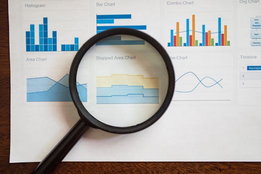
Choosing the Right Chart
.png)
Selecting an appropriate chart type is the cornerstone of effective data visualization. The nature of your data and the story you want to tell should guide your choice:
- Bar Charts: Ideal for comparing quantities across various groups.
- Line Charts: Best suited for depicting trends over time.
- Pie Charts: Effective for showing composition and emphasizing proportions.
- Scatter Plots: Useful for identifying correlations and distributions among numerical variables.
Align your chart type with the primary insight you wish to communicate to ensure your message is clear and direct.
Embrace Simplicity
A common pitfall in chart design is overload—too much data, excessive colors, and unnecessary labels can obscure your message:
- Reduce Clutter: Minimize non-essential elements like heavy grid lines and excessive tick marks.
- Focus on Data: Highlight key information and avoid distracting your audience with secondary details.
Simplicity enhances readability and allows your audience to grasp the data quickly and effortlessly.
Strategic Use of Color
Color is a powerful tool in distinguishing elements within your chart, but its misuse can lead to confusion or misinterpretation:
- Purposeful Color Use: Apply color to highlight significant data points or to differentiate data sets clearly.
- Accessibility: Choose a palette that is readable by people with color vision deficiencies, ensuring inclusivity.
Tools like Adobe Color or ColorBrewer can assist in selecting an accessible and appealing palette.
Clear Labeling
Every chart must communicate its data as independently as possible, requiring minimal explanation:
- Descriptive Labels: Use clear, concise labels for axes and data series.
- Effective Legends: Employ legends to clarify datasets, especially when dealing with multiple categories or variables.
Proper labeling eliminates ambiguities and aids in the faster comprehension of data.
Know Your Audience
Understanding the knowledge level and interests of your audience can significantly influence the effectiveness of your data presentation:
- Adjust Complexity: Simplify complex data for a general audience, or delve deeper for technical viewers.
- Engage and Inform: Aim to engage your audience with data presented in a form that resonates with their level of understanding.
Audience-centric design increases the relevance and impact of your visual data communication.
Annotations and Emphasis
Annotations serve as a guide, helping to draw attention to important aspects or anomalies in the data:
- Selective Highlighting: Use tools like arrows, text annotations, or spotlight effects judiciously to emphasize key findings.
- Clarity and Context: Annotations should clarify, not clutter. Ensure they add real value and context.
Annotations should enhance the narrative without overwhelming the visual integrity of the chart.
Test and Iterate
Feedback is invaluable in refining chart design:
- Pilot Testing: Share your initial designs with a small segment of your target audience.
- Iterative Improvement: Incorporate feedback to fine-tune clarity, readability, and impact.
Testing your chart with real users can uncover insights that improve data presentation markedly.
Stay Informed and Innovative
The field of data visualization is rapidly evolving. Stay informed about new tools, trends, and methodologies:
- Continuous Learning: Participate in webinars, workshops, and courses.
- Experimentation: Try new tools and techniques to discover what best enhances your data visualization.
Ongoing education and experimentation can lead to more innovative and effective chart designs.
Conclusion
Mastering chart design is an ongoing process of learning and adaptation. By focusing on clarity, audience needs, and effective visual communication, you can transform complex data into insightful, impactful visual stories. Embrace these principles to enhance your ability to communicate through data, ensuring your visuals are as informative as they are compelling.