Title: Excel Charts: Techniques for Visualizing Large Datasets
Introduction In the digital age, where data is ubiquitous, the ability to visualize large datasets effectively is critical for analysis and decision-making. Microsoft Excel, one of the most prevalent tools for data handling, provides various charting techniques ideal for depicting complex data in an easily digestible format. This article delves into best practices for creating Excel charts tailored for large datasets, ensuring clarity and efficiency.
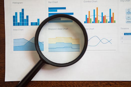
Understanding the Basics of Excel Charts To leverage Excel's charting capabilities fully, it's essential to understand its basic functionalities. Excel offers a plethora of chart types such as line charts, bar charts, pie charts, and scatter plots, each serving unique purposes. For instance, line charts are perfect for illustrating trends over time, whereas bar charts excel in comparing quantities across different categories.
.png)
Choosing the Right Chart Type The key to effective data visualization in Excel, especially with large datasets, lies in selecting the appropriate chart type. This choice should align with the nature of your data and the insights you aim to convey. For displaying trends within extensive data logs, line charts might be ideal, while clustered bar charts could better serve comparative analyses of product sales performances.
Utilizing Pivot Charts for Large Datasets Pivot charts, building on the capabilities of PivotTables, are exceptionally suited for analyzing large datasets. They allow users to summarize and transform complex data into a visual representation without altering the original dataset. Start by creating a PivotTable, then proceed to generate a chart from this data, facilitating efficient and dynamic data exploration.
Applying Conditional Formatting in Charts Conditional formatting enhances Excel chart visualizations by allowing users to highlight critical data points, differentiate between data series, and spotlight trends or outliers. Utilizing color scales to represent varying data values can simplify the detection of patterns and anomalies within large datasets, making the charts more intuitive.
Leveraging Excel's Advanced Chart Features To further refine your charts for large datasets, consider these advanced Excel features:
- Adding a secondary axis helps plot data with varied scales simultaneously, clarifying and enriching the chart.
- Dynamic named ranges adjust automatically as data changes, ideal for frequently updated datasets.
- Interactive charts, facilitated by slicers and timelines, allow users to manipulate the data displayed interactively, enhancing the analytical process.
Optimizing Chart Performance Handling large datasets in Excel can strain performance. To enhance efficiency, consider these tips:
- Limit data points: Avoid overcrowding your charts with excessive data points. Aggregate data where possible to maintain performance without compromising on insight.
- Avoid volatile functions: Functions like INDIRECT, OFFSET, and TODAY can slow down Excel when recalculating large datasets. Minimize their use where feasible.
- Update Excel: Using the latest version of Excel ensures access to optimized features for handling large datasets, including advanced charting tools and better data processing capabilities.
Conclusion Excel's robust toolkit for data visualization makes it an excellent choice for managing large datasets. By carefully selecting chart types, employing pivot charts, and implementing conditional formatting, you can enhance your data presentations significantly. Additionally, taking advantage of Excel’s advanced features and optimizing chart performance will ensure that your data analyses are both effective and efficient. Remember, the goal is to make complex data comprehensible at a glance, facilitating better insights and decisions.